Newcastle United FC
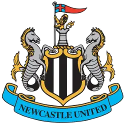
It was decided to go back to the team’s roots and refine the original coat of arms of Newcastle upon Tyne. Thus, composition artists added a shield, painted black and white stripes, which recalls team shirts. But the turret over the shield remained the same. The royal lion with the flag of St. George symbolizes the exploits of the city, which was attacked several times in the 14th century and besieged by Scots during the civil war. Speaking about two seahorses, they remained on the emblem, but the inscription “brave defenders” was replaced by the name of the club. There was no place on the modern Newcastle logo only for the magpie, but the nickname of the Newcastle players was fixed in people’s minds forever.

Newcastle United FCNuggets
2017 - 2018
Newcastle United celebrated its 125th anniversary during the 2017/18 season and a special commemorative crest was commissioned as part of the club's celebrations. The gold and silver design was based on the Magpies’ existing crest and a golden adornment was added to signify the milestone year.
Newcastle United FCNuggets
1983 - 1988
The 1983 NUFC logo was entirely different in style. Bold black letters “NUF” were squeezed in a roundel shape, with an upturned letter “C” below. The only component borrowed from the previous version is the magpie, which now grew much smaller and at the very bottom.
Newcastle United FCNuggets
1976 - 1983
The crest that was adopted in 1976, was a more club-specific emblem. Although it still had Castle Keep as its central component, it was now depicted in a different, more straightforward style. Below the castle is the River Tyne. The design served as a background to a black and white magpie reminding that the team has been nicknamed “The Magpies. The image was encircled by the team’s wordmark "NEWCASTLE UNITED FOOTBALL CLUB" in white over a black background.
Newcastle United FCNuggets
1969 - 1976
In 1969 a new modern look to the original crest. Keeping the three castles and seahorses on either side. Removing the arched wordmark from the original on this emblem.
Newcastle United FCNuggets
1892 - 1969
From the day of its foundation in 1892 and until 1968, Newcastle performed with the coat of arms of the city on its chest. Three towers, depicted on it, symbolized the fortress, which was founded by Robert Kurtgez, the son of William the Conqueror. For a long time, it was the northernmost fortress of England and served as a defense against the Norman raids. Two sea horses on the sides symbolized the close connection of the city with the sea. And the inscription under the emblem Fortiter Defendit Triumphans also referred to the times of confrontation between the English and Scandinavian tribes.
Newcastle United FC Logo History
The Newcastle United FC logo history officially began with the city’s coat of arms. It featured two seahorses and a castle to represent the local maritime heritage. However, the club introduced a circular Newcastle United FC logo in the 1970s. This design showcased a magpie standing in front of the Tyne Bridge. Therefore, the team embraced its famous nickname through its visual branding. This classic Newcastle United FC logo PNG remains a favorite for vintage shirt collectors.
Furthermore, the club returned to a shield-based design in 1988. This modern Newcastle United FC logo restored the seahorses but with a cleaner, digital aesthetic. You can visit our Manchester United FC logo page to see how other historic clubs use heraldic symbols. By refining the Newcastle United FC logo PNG assets, the club ensures its identity stays sharp on screen. Ultimately, the blue and white seahorses protect the central black and white shield.
The Newcastle United FC logo continues to inspire the "Toon Army" at St. James' Park. You can visit the Newcastle United FC team history page to learn about their trophies. We provide a complete record of the Newcastle United FC logo history for all fans. Every update to the Newcastle United FC logo PNG captures a unique era of success. Consequently, the crest remains a powerful badge of honor for the city of Newcastle.
College Sports Fan Products
