
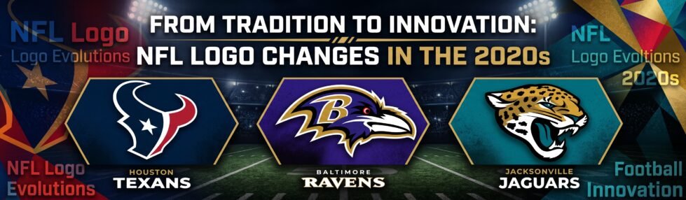
NFL fans can forgive a bad draft pick faster than a bad logo. Change the colors, revive an old mark, or redraw a helmet, and everyone suddenly has an opinion.
NFL teams do not change their logos every season, which is exactly why fans notice when they do. Since 2020, several franchises have altered their visual identity in very different ways, from Washington replacing its entire identity to Houston adding a new H-Town mark alongside its existing bull logo. The decade has produced genuine redesigns alongside deliberate returns to older looks, with fan attachment playing a big part in several decisions. These NFL logo changes in the 2020s have sparked significant discussion among fans and experts alike.
Some Teams Changed Less Than You Think
Cincinnati is a good place to start because its 2020s change was easy to miss. The Bengals kept the striped “B” that has served as their primary logo since 2004, but altered its color in 2021. The orange became darker, bringing the logo into line with the shade that had already appeared on the team’s uniforms since 2012.
That sounds tiny next to a complete rebrand, yet football fans notice it. Put the wrong orange on a Bengals helmet, shirt, or television graphic, and someone will spot it before kickoff. Cincinnati’s update also shows that a modern NFL redesign does not require throwing away an established symbol. Sometimes the job is simply to make the existing identity work consistently across uniforms and other uses.
The Chargers went further in 2020, simplifying their lightning bolt by removing one outline and sharpening the overall design. Washington went much further again, dropping its previous identity in 2020 before becoming the Commanders in 2022. No single formula has defined NFL logo changes this decade.
Houston Put the City Into the Redesign

Houston’s 2024 overhaul gave fans several new visual elements without replacing the bull-head logo that had represented the Texans since the franchise began play in 2002.
Liberty White debuted on September 8, followed by the new Deep Steel Blue look on September 29. The H-Town uniform arrived on October 6 with a new “H” helmet logo, then Battle Red introduced its bullhorn helmet in Week 10.
The result gave Houston extra identities to use alongside the existing logo, rather than asking fans to accept a replacement.
NFL Branding Now Goes Well Beyond the Helmet
A team identity follows you far beyond the stadium now. The colors and logos appear throughout broadcasts, social feeds, and the betting activity surrounding an NFL Sunday, so commercial offers have become another part of the wider game-day picture.
Promotions are a good example because the headline figure is only the start of the story. The useful number depends on what you must deposit, what qualifying activity is required, and how long the promotional credit remains available.
That is where the terms and conditions explained on Covers.com become useful, because Novig’s headline $25 offer is actually split into five $5 Trade Credits, with a $10 minimum deposit, a $5 qualifying trade and a 30-day expiry.
That detail is worth reading before treating $25 as a simple cash figure. The promotion has its own structure, just as the wider NFL product surrounding a game has become far broader than the action on the field.
Baltimore Shows the Value of Leaving a Logo Alone
Baltimore offers the opposite lesson. The current Ravens bird-head logo has stayed largely intact through the 2020s, carrying the purple-and-black identity that supporters already connect with the franchise.
The raven itself also has a direct Baltimore connection through Edgar Allan Poe, whose poem gave the team its name, so replacing the mark would mean giving up a lot of built-in history.
There is nothing wrong with deciding that the logo already does its job.
Jacksonville Found Value in Going Backward

Jacksonville took another route in 2024 by reaching into its own past. The Jaguars brought back their older prowling-jaguar helmet logo as part of the Prowler Throwbacks, reconnecting the current team with the look worn during the franchise’s early years.
The original uniform ran from 1995 through 1997 before a modified version followed, and the franchise continued changing elements of its look in the seasons that came afterward.
That makes Jacksonville part of one of the clearest NFL design trends of the 2020s: teams are treating old artwork as something they can use again. A logo does not need to be invented from scratch to look new to younger fans, and older supporters immediately understand the reference.
The 2020s Have Been About Recognition, Not Reinvention
The biggest NFL identity changes of this decade have taken very different routes. Washington started again, Cincinnati made a small color adjustment, and Houston added new marks around an existing logo. Jacksonville went back to its archives, whereas Baltimore largely stayed put.
That variety is the interesting part. NFL logos carry years of football memories with them, so even a small alteration gives fans something to argue about long before anyone takes a snap.