The Los Angeles Kings’ logo has changed dramatically since the team joined the NHL in 1967. Their first design featured a jewel-encrusted crown in purple and gold colors, officially called “Forum Blue.” This royal theme established their unique identity in professional hockey. The Kings’ visual brand changed a lot over time. A significant shift happened in 1988 when the team …

The Best NHL Logos in History
Regarding sports logos, the NHL takes the cake for providing maximum exposure. Unlike other major leagues, whose logos are often relegated to less visible positions on their uniforms or fields, hockey logos remain prominently displayed. And let’s face it – they deserve that prime spot! Each team’s logo is a carefully crafted representation of their city or region, serving as …
NHL Teams Logo Battle – Vote for the Best NHL Logos
Welcome to the NHL Teams Logo Battle, where hockey fans can view every NHL teams logo and vote for their favorites. Compare classic and modern designs, support your team, and see which emblems rise among the NHL best logos as fans help decide the most iconic symbols in hockey.NHL Logo BattlesWC Central Logo BattleWC Pacific Logo BattleEC Atlantic Logo BattleEC …
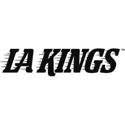
Los Angeles Kings Logo History – Wordmark Logo
The Los Angeles Kings logo shines in the team’s wordmark logo collection, evolving since 1967 in the NHL. Its bold text reflects California’s regal spirit. Therefore, the Los Angeles Kings logo history captivates collectors. Moreover, the NHL Los Angeles Kings logo showcases vibrant identity and regional pride. Los Angeles Kings 2025 – Present A throwback logo to the one used …

NHL Logo – Wordmark Logos of All NHL Teams
The NHL logo collection showcases wordmark logos for all NHL teams, evolving since 1917 with the league’s founding. These bold text designs reflect each team’s unique identity. Therefore, the NHL logo hockey legacy captivates collectors. Moreover, the NHL logo team wordmarks highlight vibrant heritage and regional pride across the league.NHL Primary LogoNHL Alternate LogoNHL Logo BattleNHL Team HistoryAnaheim Ducks Wordmark …
NHL Logo History – All NHL Team Logos from Past to Present
The NHL logo represents decades of hockey tradition and team pride. This page brings together every design from all NHL logo team collections, along with high-resolution NHL logo PNG files for detailed viewing. Whether you enjoy the sport’s history or follow the latest styles, you can explore each emblem here in one easy-to-browse archive filled with timeless hockey graphics and …
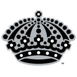
Los Angeles Kings Logo History – Alternate Logo
The Los Angeles Kings logo shines in the team’s alternate logo collection, evolving since 1967 in the NHL. Its bold crown design reflects California’s regal spirit. Therefore, the Los Angeles Kings logo history captivates collectors. Moreover, the NHL Los Angeles Kings logo showcases vibrant identity and regional pride. Los Angeles Kings 2025 – Present A throwback logo to the one …
NHL Logo – Alternate Logos of All NHL Teams
The NHL logo collection showcases alternate logos for all NHL teams, evolving since 1917 with the league’s founding. These bold designs reflect each team’s unique spirit. Therefore, the NHL logo hockey legacy captivates collectors. Moreover, the NHL logo team emblems highlight vibrant identities and regional pride across the league.NHL Primary LogoNHL Wordmark LogoNHL Logo BattleNHL Team HistoryAnaheim Ducks A webbed …
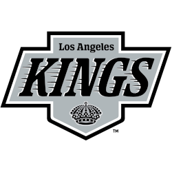
Los Angeles Kings Logo History – Primary Logo
The Los Angeles Kings primary logo collection highlights the team’s regal NHL history. With bold crown-inspired designs, the Los Angeles Kings logo ignites team spirit. This collection explores team history, linking fans to the vibrant legacy of NHL Los Angeles Kings logo designs. Los Angeles Kings 2025 – Present A throwback logo to the one used by the club from …
NHL Logo – Primary Logos of All NHL Teams
The NHL primary logo collection showcases the vibrant history of National Hockey League teams. With bold designs, the NHL logo represents team pride. This collection explores team legacies, connecting fans with the dynamic heritage of NHL logo hockey.NHL Alternate LogoNHL Wordmark LogoNHL Logo BattleNHL Team History Anaheim Ducks A duck’s goalie mask in white with black holes and gold highlights …