The Los Angeles Kings’ logo has changed dramatically since the team joined the NHL in 1967. Their first design featured a jewel-encrusted crown in purple and gold colors, officially called “Forum Blue.” This royal theme established their unique identity in professional hockey. The Kings’ visual brand changed a lot over time. A significant shift happened in 1988 when the team …
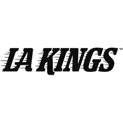
Los Angeles Kings Logo History – Wordmark Logo
The Los Angeles Kings logo shines in the team’s wordmark logo collection, evolving since 1967 in the NHL. Its bold text reflects California’s regal spirit. Therefore, the Los Angeles Kings logo history captivates collectors. Moreover, the NHL Los Angeles Kings logo showcases vibrant identity and regional pride. Los Angeles Kings 2025 – Present A throwback logo to the one used …
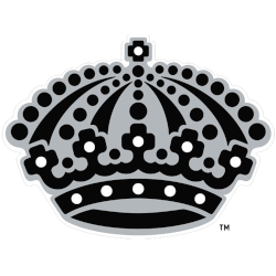
Los Angeles Kings Logo History – Alternate Logo
The Los Angeles Kings logo shines in the team’s alternate logo collection, evolving since 1967 in the NHL. Its bold crown design reflects California’s regal spirit. Therefore, the Los Angeles Kings logo history captivates collectors. Moreover, the NHL Los Angeles Kings logo showcases vibrant identity and regional pride. Los Angeles Kings 2025 – Present A throwback logo to the one …
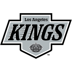
Los Angeles Kings Logo History – Primary Logo
The Los Angeles Kings primary logo collection highlights the team’s regal NHL history. With bold crown-inspired designs, the Los Angeles Kings logo ignites team spirit. This collection explores team history, linking fans to the vibrant legacy of NHL Los Angeles Kings logo designs. Los Angeles Kings 2025 – Present A throwback logo to the one used by the club from …