Prominent NHL team, the Vancouver Canucks have had several changes over their history, and their logo is no exception. From modest origins to becoming one of the most identifiable logos in hockey, the development of the Canucks logo offers a unique window into the team’s character and connection to Vancouver. Their primary logo’s history is rich in modifications that mirror …

Unveiling the Secret Behind Canada’s Most Memorable NHL Logos
In a country where Hockey is adored, NHL logos are more than just badges or emblems in Canada. They beat cultural significance, which ensures these logos outlive trends. Like the striking orca of the Vancouver Canucks, many of these logos tell the story of the team’s identity and background. One can spot a pattern of significant and memorable logos in …

7 Classic Canadians Logos from the NHL
It’s no secret that ice hockey is the most popular sport in Canada. In addition to being the country’s favorite pastime, it is also the official national winter sport and a one-of-a-kind Canadian trademark. As the contemporary sport of hockey originated in Montreal, it comes as no surprise that various competitions are held in the country regularly, such as the …
NHL Teams Logo Battle – Vote for the Best NHL Logos
Welcome to the NHL Teams Logo Battle, where hockey fans can view every NHL teams logo and vote for their favorites. Compare classic and modern designs, support your team, and see which emblems rise among the NHL best logos as fans help decide the most iconic symbols in hockey.NHL Primary LogoNHL Alternate LogoNHL Wordmark LogoNHL Team HistoryNHL Greatest Player (Unlimited …
Vancouver Canucks Simplify Primary Logo Again
The Vancouver Canucks will sport several different looks during the 2019-2020 season, which marks their 50th anniversary. The primary logo isn’t changing. The only difference is that the wordmark “VANCOUVER,” which was added in 2008, is being removed. The letter “C” with the orca breaking out of the ice remains the same as it has since 2008, when the blue …

Vancouver Canucks Logo History – Wordmark Logo
The Vancouver Canucks logo shines in the team’s wordmark logo collection, evolving since 1970 in the NHL. Its sleek text reflects British Columbia’s coastal spirit. Therefore, the Vancouver Canucks logo history captivates collectors. Moreover, the Vancouver Canucks logo animal showcases vibrant identity and regional pride. Vancouver Canucks 2020 – Present A dark blue, white and grey Orca whale bursting out …

NHL Logo – Wordmark Logos of All NHL Teams
The NHL logo collection showcases wordmark logos for all NHL teams, evolving since 1917 with the league’s founding. These bold text designs reflect each team’s unique identity. Therefore, the NHL logo hockey legacy captivates collectors. Moreover, the NHL logo team wordmarks highlight vibrant heritage and regional pride across the league.NHL Primary LogoNHL Alternate LogoNHL Logo BattleNHL Team HistoryAnaheim Ducks Wordmark …
NHL Logo History – All NHL Team Logos from Past to Present
The NHL logo represents decades of hockey tradition and team pride. This page brings together every design from all NHL logo team collections, along with high-resolution NHL logo PNG files for detailed viewing. Whether you enjoy the sport’s history or follow the latest styles, you can explore each emblem here in one easy-to-browse archive filled with timeless hockey graphics and …
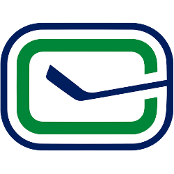
Vancouver Canucks Logo History – Alternate Logo
The Vancouver Canucks logo shines in the team’s alternate logo collection, evolving since 1970 in the NHL. Its bold orca design reflects British Columbia’s coastal spirit. Therefore, the Vancouver Canucks logo history captivates collectors. Moreover, the Vancouver Canucks logo animal showcases vibrant identity and regional pride. Vancouver Canucks 2020 – Present A dark blue, white and grey Orca whale bursting …
NHL Logo – Alternate Logos of All NHL Teams
The NHL logo collection showcases alternate logos for all NHL teams, evolving since 1917 with the league’s founding. These bold designs reflect each team’s unique spirit. Therefore, the NHL logo hockey legacy captivates collectors. Moreover, the NHL logo team emblems highlight vibrant identities and regional pride across the league.NHL Primary LogoNHL Wordmark LogoNHL Logo BattleNHL Team HistoryAnaheim Ducks A webbed …
- Page 1 of 2
- 1
- 2