In the NHL, logos are more than mere signs—they embody the identity and spirit of the organizations in which they play. For the San Jose Sharks, a team that began playing in 1991, their logo has served as their symbol, representing the fierce edge of the sport and the franchise. But as with everything in sports, the logo didn’t remain …
A History of the NHL’s Current Logos
The National Hockey League (NHL) stands as a coliseum of history, tradition, and identity, encapsulated within the iconic logos that have adorned the jerseys of its teams over the decades. These logos are more than mere symbols; they are emblems of pride, history, and a deep-seated affection for hockey that resonates with fans worldwide. From the vintage crests of the …

The Best NHL Logos in History
Regarding sports logos, the NHL takes the cake for providing maximum exposure. Unlike other major leagues, whose logos are often relegated to less visible positions on their uniforms or fields, hockey logos remain prominently displayed. And let’s face it – they deserve that prime spot! Each team’s logo is a carefully crafted representation of their city or region, serving as …

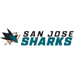
San Jose Sharks Reveal New Wordmark Logos
San Jose Sharks Wordmark Logo 2021 – Present The San Jose Sharks recently revealed several versions of a new wordmark logo for their National Hockey League team prior to the start of the 2021 season. With the new release, they’ve also retired several older secondary logos that haven’t received much use lately. Here’s the scoop on exactly what has changed. …
San Jose Sharks Logo History – Wordmark Logo
The San Jose Sharks logo shines in the team’s wordmark logo collection, evolving since 1991 in the NHL. Its sleek text reflects California’s coastal spirit. Therefore, the San Jose Sharks logo history captivates collectors. Moreover, the original San Jose Sharks logo showcases vibrant identity and regional pride. San Jose Sharks 2009 – Present The new and still active primary logo …

San Jose Sharks Logo History – Alternate Logo
The San Jose Sharks logo shines in the team’s alternate logo collection, evolving since 1991 in the NHL. Its bold shark design reflects California’s coastal spirit. Therefore, the San Jose Sharks logo history captivates collectors. Moreover, the original San Jose Sharks logo showcases vibrant identity and regional pride. San Jose Sharks 2009 – Present The new and still active primary …
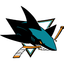
San Jose Sharks Logo History – Primary Logo
The San Jose Sharks primary logo collection showcases the team’s fierce NHL history. With bold shark fin designs, the San Jose Sharks logo ignites team spirit. This collection explores San Jose Sharks logo history, connecting fans to the vibrant legacy of original San Jose Sharks logo designs. San Jose Sharks 2009 – Present The new and still active primary logo …