The New York Rangers are a professional ice hockey team based in New York City. The team has had several logos throughout its history, each one representing a different era in the team’s history. Let’s examine the details here. 1926 – The Inception Logo The New York Rangers, a professional ice hockey team based in New York City, was founded …
NHL Teams Logo Battle – Vote for the Best NHL Logos
Welcome to the NHL Teams Logo Battle, where hockey fans can view every NHL teams logo and vote for their favorites. Compare classic and modern designs, support your team, and see which emblems rise among the NHL best logos as fans help decide the most iconic symbols in hockey.NHL Logo BattlesWC Central Logo BattleWC Pacific Logo BattleEC Atlantic Logo BattleEC …
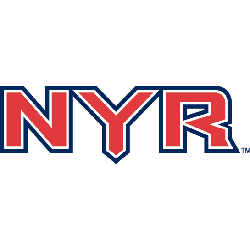
New York Rangers Logo History – Wordmark Logo
The New York Rangers logo shines in the team’s wordmark logo collection, evolving since 1926 in the NHL. Its sleek text reflects New York’s proud spirit. Therefore, the New York Rangers logo history captivates collectors. Moreover, the NHL New York Rangers logo showcases vibrant identity and regional pride. New York Rangers 2000 – Present A red, white, and blue shield …

NHL Logo – Wordmark Logos of All NHL Teams
The NHL logo collection showcases wordmark logos for all NHL teams, evolving since 1917 with the league’s founding. These bold text designs reflect each team’s unique identity. Therefore, the NHL logo hockey legacy captivates collectors. Moreover, the NHL logo team wordmarks highlight vibrant heritage and regional pride across the league.NHL Primary LogoNHL Alternate LogoNHL Logo BattleNHL Team HistoryAnaheim Ducks Wordmark …
NHL Logo History – All NHL Team Logos from Past to Present
The NHL logo represents decades of hockey tradition and team pride. This page brings together every design from all NHL logo team collections, along with high-resolution NHL logo PNG files for detailed viewing. Whether you enjoy the sport’s history or follow the latest styles, you can explore each emblem here in one easy-to-browse archive filled with timeless hockey graphics and …
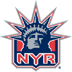
New York Rangers Logo History – Alternate Logo
The New York Rangers logo shines in the team’s alternate logo collection, evolving since 1926 in the NHL. Its bold shield design reflects New York’s proud spirit. Therefore, the New York Rangers logo history captivates collectors. Moreover, the NHL New York Rangers logo showcases vibrant identity and regional pride. New York Rangers 2000 – Present A red, white, and blue …
NHL Logo – Alternate Logos of All NHL Teams
The NHL logo collection showcases alternate logos for all NHL teams, evolving since 1917 with the league’s founding. These bold designs reflect each team’s unique spirit. Therefore, the NHL logo hockey legacy captivates collectors. Moreover, the NHL logo team emblems highlight vibrant identities and regional pride across the league.NHL Primary LogoNHL Wordmark LogoNHL Logo BattleNHL Team HistoryAnaheim Ducks A webbed …
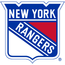
New York Rangers Logo History – Primary Logo
The New York Rangers primary logo collection showcases the team’s iconic NHL history. With bold shield designs, the New York Rangers logo ignites team spirit. This collection explores NHL New York Rangers logo history, connecting fans to the vibrant legacy of Rangers hockey. New York Rangers 2000 – Present A red, white, and blue shield with the wordmark “NEW YORK” …
NHL Logo – Primary Logos of All NHL Teams
The NHL primary logo collection showcases the vibrant history of National Hockey League teams. With bold designs, the NHL logo represents team pride. This collection explores team legacies, connecting fans with the dynamic heritage of NHL logo hockey.NHL Alternate LogoNHL Wordmark LogoNHL Logo BattleNHL Team History Anaheim Ducks A duck’s goalie mask in white with black holes and gold highlights …