Sports Logo History Oakland Raiders 60th Anniversary Logo The Raiders’ 60th and final season playing in California is being commemorated with a special logo that the team will wear on both it’s home and away jerseys this season. There’s a lot to unpack with this logo, which will look great on both the white and black uniform tops. The font …
Orioles New Ornithologically Correct Bird Logo!
Seven years after reintroducing the cartoon bird as an alternate logo that appeared on the team’s caps, the Baltimore Orioles have gone all-in by making it their primary logo starting in 2019. The logo replaces the Orioles scripted logo with the “Ornithologically Correct Bird” that was first used as an official logo in 1992 to mark the team’s move to …
Tampa Bay Rays New Logo Goes Minimalist Style
For the first time since a radical redesign going into the 2008 season, the Tampa Bay Rays have a new logo. Granted, the change for 2019 isn’t nearly as large as the one 11 years prior, but it does place more prominence on the name itself and the sunburst inside the logo. Tampa Bay Rays Primary Logo 2019 – Present …
Kansas City Royals Update their Identity
Before the people of Kansas City developed their longstanding and staunch support for the Kansas City Royals baseball team, they had been abandoned by their previous city franchise. The Kansas City Athletics used to Kansas City Royals Primary Logo 2002 – 2018 represent the city in the American League in the past. Unfortunately, the owner of the sports franchise had …
Chief Wahoo Logo: Rise and Fall
Chief Wahoo does not need to be introduced as he is the classic/famous logo of the Cleveland Indians. Many modifications and types of Cleveland Indians’ Chief Wahoo logos are well known. The Cleveland Indians’ Chief Wahoo story, had begun more than 75 years ago and stopped last year when Major League Baseball announced that the Indians would no longer use …
What the Phillies’ New Logo Means for the National League Franchise?
Philadelphia Phillies Primary Logo 2019 – Present The Philadelphia Phillies unveiled their new logo in early December. The new logo as we have shown here on Sports Logo History isn’t a dramatic makeover, but rather a slight tweak. The Phillies’ cursive typography — sans the red underline — is retained, along with the stars that dot the two I’s. Also …
Miami Marlins – It’s a New Beginning, a New Chapter in this Organization
Recently, the Miami Marlins presented exciting news about their new logo as a part of a new path for the organization under the new ownership group. The refreshed look further puts a stamp of the ownership group headed by Bruce Sherman and Derek Jeter on the organization. Now the club’s color palette has been changed ever-so-slightly and the team’s primary …
#1 Ultimate Guide to NBA’s Brooklyn Nets Logo History
The Nets have a great history that spans almost 50 years and with two different basketball leagues. Starting in 1968 in the American Basketball Association, the Nets have moved back and forth in the northeast before merging into the National Basketball Association in 1976 and settling in the city of Brooklyn in 2012. Along with the moves, the Nets have …
#1 Ultimate Guide to NFL’s Arizona Cardinals Logo History
The Arizona Cardinals are one of the oldest teams in the NFL, dating back to the league’s inaugural football season in 1920. A lot has changed in the game of football since then, and the Cardinals’ team is no different. Not only has the team made many changes and many locations changes over the years, so have their primary logo! …
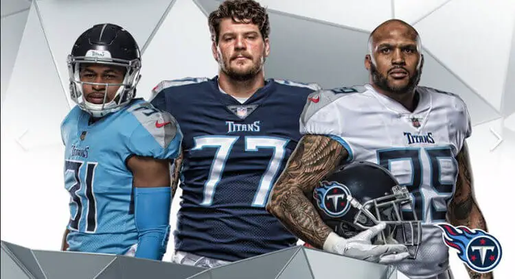
New Tennessee Titans Uniforms: Taking Inspiration from Logos
“They were gods, giant gods.” That’s how Tennessee Titans controlling owner Amy Adams Strunk described Titans of Greek mythology. “So we wanted that feel” she continued. “It’s going to be what you think of a Titan.” Strunk was referring to the new uniforms and helmets the Titans will be wearing when they take the field for the new season. The athletic company …


