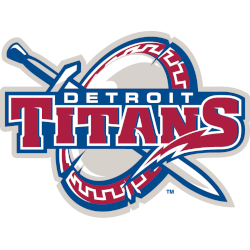
Titans Wordmark Logo For decades, Cal State Fullerton Titans have proudly represented their school with a recognizable and iconic logo. The school’s wordmark logo has been around since the 1960s when it was first adopted by the athletic department for use on uniforms and other merchandise. Over the years, this classic design has evolved to reflect changing times while still …
Cal State Fullerton Titans Alternate Logo
Titans Alternate Logo For decades, the Cal State Fullerton Titans have proudly represented their school and its values with a variety of logos. Over the years, these symbols have evolved to reflect changes in design trends as well as changes within the university itself. Today we’re taking a look back at some of these iconic designs that helped shape one …
Cal State Fullerton Titans Primary Logo
Titans Primary Logo For more than 50 years, the Cal State Fullerton Titans have proudly represented their school and community with a powerful logo. From its humble beginnings as a simple interlocking “CSF” to its current incarnation, this iconic symbol has become synonymous with Titan pride. Let’s take a look at the history of the primary logo for Cal State …
New Tennessee Titans Uniforms: Taking Inspiration from Logos
“They were gods, giant gods.” That’s how Tennessee Titans controlling owner Amy Adams Strunk described Titans of Greek mythology. “So we wanted that feel” she continued. “It’s going to be what you think of a Titan.” Strunk was referring to the new uniforms and helmets the Titans will be wearing when they take the field for the new season. The athletic company …
Tennessee Titans Wordmark Logo
Titans Wordmark Logo The Tennessee Titans have a long and storied history with their wordmark logo. The team was founded in 1960 as the Houston Oilers, and they used an oil derrick-style logo for most of their time in Houston. This classic design featured the words “Houston Oilers” written across a blue circle, surrounded by orange flames stretched out to …
Tennessee Titans Primary Logo
Titans Primary Logo The Tennessee Titans have a long and storied history, with their primary logo being no exception. The team’s first official logo was introduced in 1999 when the franchise moved from Houston to Nashville. This original design featured an “oil derrick” as its main element, which represented the oil industry of Texas and symbolized strength and power. Additionally, …
The Titans of New York Primary Logo
Titans Primary Logo The New York Titans’ primary logo has been around since the team’s inception in 1960. The original logo featured a blue and white shield with an orange “NY” on it, symbolizing the city of New York. This design was used until 1966, when a new version of the logo was introduced, featuring a more modernized look with …