This page presents the full Athletics logo story with a clear focus on each official Oakland Athletics Wordmark logo used over time. Every design shown here reflects important stages in Oakland Athletics history, highlighting how the wordmark evolved while maintaining consistent branding from the team’s early years to today. Athletics 2025 – Present A green letter “A” with an apostrophe …
Athletics Logo Baseball History – Alternate Logo
The Oakland Athletics alternate logo collection showcases the team’s bold MLB spirit. Featuring dynamic elephant and “A” designs, the Athletics logo enhances team identity. This collection highlights Oakland Athletics history, uniting fans with the vibrant tradition of Oakland Athletics baseball. Athletics 2025 – Present A green letter “A” with an apostrophe “S” that had been used when they played in …
Athletics Logo History Baseball – Primary Logo
Step into the legacy of the Athletics logo, where the Oakland Athletics’ primary logo stands as a symbol of grit. Explore Oakland Athletics logo history, cheer on Oakland Athletics baseball, and dive into this iconic design. This collection showcases the primary logo that embodies the team’s spirit for passionate fans. Athletics 2025 – Present A green letter “A” with an …
Cleveland Guardians Logo History – Wordmark Logo
The Cleveland Guardians wordmark logo collection celebrates the team’s evolving MLB legacy. Featuring bold winged baseball designs, the Cleveland Guardians logo fuels team spirit. This collection highlights Cleveland Guardians logo history, uniting fans with the vibrant heritage of Cleveland Guardians baseball. Cleveland Guardians 2022 – Present A letter “G” in red with blue trim and shadowing placed on either side …
Cleveland Guardians Logo History – Alternate Logo
The Cleveland Guardians alternate logo collection showcases the team’s vibrant MLB legacy. Featuring bold “C” and winged baseball designs, the Cleveland Guardians logo enhances team spirit. This collection highlights Cleveland Guardians logo history, uniting fans with the franchise’s dynamic tradition. Cleveland Guardians 2022 – Present A letter “G” in red with blue trim and shadowing placed on either side of …
Cleveland Guardians Logo History – Primary Logo
The Cleveland Guardians primary logo represents the team’s bold MLB identity. With its iconic “G” and dynamic design, the Cleveland Guardians logo embodies pride. This collection of primary logos unites fans, showcasing the franchise’s spirit in Cleveland’s vibrant baseball scene. Cleveland Guardians 2022 – Present A letter “G” in red with blue trim and shadowing placed on either side of …
Brooklyn Dodgers Logo History – Wordmark Logo
The Brooklyn Dodgers wordmark logo collection showcases the team’s historic MLB roots. With elegant script evoking urban nostalgia, the Brooklyn Dodgers logo captures team spirit. This collection explores team history, connecting fans with the enduring legacy of Brooklyn Dodgers baseball.Brooklyn Dodgers 1952 – 1957 The “Dodgers” wordmark on a bronze diamond with a baseball above the letter “g.” Dodgers Primary …
Miami Marlins – It’s a New Beginning, a New Chapter in this Organization
Recently, the Miami Marlins presented exciting news about their new logo as part of a new direction for the organization under its new ownership group. The refreshed look further solidifies the ownership group headed by Bruce Sherman and Derek Jeter’s ownership of the organization. Now the club’s color palette has been changed ever-so-slightly, and the team’s primary “M” logo – …
New York Gothams Primary Logo
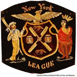
Gothams Primary Logo The New York League crest is the one and only primary logo for the New York Gothams. Gotham Team History Thank you for visiting Sports Logo History! If you use our logos for news, blogs, flyers, posters, or social media, please credit SportsLogoHistory.com. All images are 250 x 250 pixels with transparent backgrounds.Sports Logo History thanks you …
Washington Senators Logo History – Wordmark Logo
This page documents the full Washington Senators logo history, with a clear focus on each official Washington Senators Wordmark logo used during the franchise’s MLB era. All Washington Senators logos shown here reflect how wordmark designs evolved while maintaining consistent baseball branding from the team’s early years to its final seasons.Washington Senators 1957 – 1960 A caricature of a U.S. …

