Recently, the Miami Marlins presented exciting news about their new logo as part of a new direction for the organization under its new ownership group. The refreshed look further solidifies the ownership group headed by Bruce Sherman and Derek Jeter’s ownership of the organization. Now the club’s color palette has been changed ever-so-slightly, and the team’s primary “M” logo – …
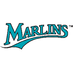
Florida Marlins Logo History – Wordmark Logo
The Florida Marlins wordmark logo collection showcases the team’s colorful MLB history. With vibrant marlin-themed script, the Florida Marlins logo captures team spirit. This collection explores team history, connecting fans with the lively legacy of Florida Marlins baseball.Florida Marlins 1993 – 2011 The Marlins first logo consisted of a marlin jumping out of a silver circle with a black trim …
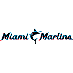
Miami Marlins Logo History – Wordmark Logo
The Miami Marlins wordmark logo collection celebrates the team’s vibrant MLB legacy. Featuring bold marlin-inspired script, the Miami Marlins logo fuels team spirit. This collection highlights team history, uniting fans with the dynamic heritage of Miami Marlins baseball. Miami Marlins 2019 – Present A blue, red, and black marlin leaping next to a baseball and wordmark “Miami” in black with …

Florida Marlins Logo History – Alternate Logo
The Florida Marlins alternate logo collection celebrates the team’s dynamic MLB legacy. Featuring bold marlin designs, the Florida Marlins logo ignites team spirit. This collection highlights Florida Marlins logo history, uniting fans with the vibrant heritage of Florida Marlins baseball.Florida Marlins 1993 – 2011 The Marlins first logo consisted of a marlin jumping out of a silver circle with a …

Miami Marlins Logo History – Alternate Logo
The Miami Marlins alternate logo collection showcases the team’s vibrant MLB legacy. Featuring bold marlin and “M” designs, the Miami Marlins logo enhances team spirit. This collection highlights Marlins logo history, uniting fans with the dynamic tradition of Miami’s exciting baseball franchise. Miami Marlins 2019 – Present A blue, red, and black marlin leaping next to a baseball and wordmark …
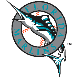
Florida Marlins Logo History – Primary Logo
The Florida Marlins primary logo embodies the team’s vibrant MLB legacy. Featuring a leaping marlin, the Florida Marlins logo captures South Florida’s spirit. This collection of primary logos showcases the Florida Marlins logo history, uniting fans with the team’s dynamic tradition.Florida Marlins 1993 – 2011 The Marlin’s first logo consisted of a marlin jumping out of a silver circle with …
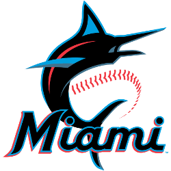
Miami Marlins Logo History – Primary Logo
The Miami Marlins primary logo captures the team’s vibrant MLB spirit. With its bold marlin and neon colors, the Miami Marlins logo radiates energy. This collection of primary logos unites fans, showcasing the franchise’s dynamic legacy at loanDepot Park. Miami Marlins 2019 – Present A blue, red, and black marlin leaping next to a baseball and wordmark “Miami” in black …