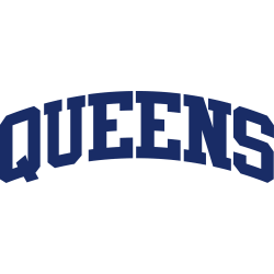
Before the people of Kansas City developed their longstanding and staunch support for the Kansas City Royals baseball team, they had been abandoned by their previous city franchise. The Kansas City Athletics used to Kansas City Royals Primary Logo 2002 – 2018 represent the city in the American League in the past. Unfortunately, the owner of the sports franchise had …
Rochester Royals Alternate Logo
Royals Alternate Logo The Rochester Royals were a professional basketball team in the National Basketball Association (NBA) from 1948 to 1957. During their time in the league, they had several alternate logos that have become iconic symbols of their legacy. The first logo was designed by legendary artist Bob Peak and featured a crown with an R inside it, symbolizing …
Kansas City Royals Wordmark Logo
Royals Wordmark Logo The Kansas City Royals have a long and storied history, which is reflected in their wordmark logo. The original Royals logo was adopted when the team moved to Kansas City in 1969. It featured an interlocking “KC” with a crown above it, set against a royal blue background. This design remained largely unchanged until 1993 when the …
Kansas City Royals Alternate Logo
Royals Alternate Logo The Kansas City Royals have a long and storied history with their alternate logo. The team was founded in 1969, and the first alternate logo they used was an interlocking “KC” that appeared on the caps of their players during home games. This design has remained a staple for over 40 years, but it wasn’t until 1985 …
Kansas City Royals Primary Logo
Royals Primary Logo The Kansas City Royals have a long and storied history, dating back to 1969 when the team was founded. Throughout their existence, they’ve had several different logos that represent the city and its baseball heritage. The primary logo of the Royals has gone through many changes over time, but it has always been an important part of …
Rochester Royals Primary Logo
Royals Primary Logo The Rochester Royals’ primary logo has a long and storied history. First introduced in 1945, the original design featured an image of a crowned lion with its paw resting on a basketball. This logo was used until 1954 when it was replaced by one featuring two crossed swords behind the same crowned lion. The crossed swords were …
Cincinnati Royals Primary Logo
Royals Primary Logo The Cincinnati Royals primary logo history is an interesting one, as it has evolved over the years and changed with the times. The original logo was created in 1949 when the team was first founded and featured a shield shape with a blue background, white lettering spelling out “Cincinnati” at top of the design and two basketballs …