Recently, the Miami Marlins presented exciting news about their new logo as part of a new direction for the organization under its new ownership group. The refreshed look further solidifies the ownership group headed by Bruce Sherman and Derek Jeter's ownership of the organization. Now the club's color palette has been changed ever-so-slightly, and the team's primary "M" logo – introduced in 2012 – has been redesigned. The new logo is designed to resemble the city's famous neon nightclub signs.

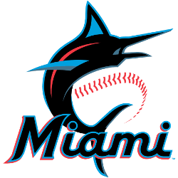
Miami Marlins Primary Logo 2019 - Present
“The logo and colors aim to capture the rich baseball history, diversity, and energy of the area,” the Marlins said in their recent release in November. “The pairing of Miami Blue and Caliente Red pop off of the base color of Midnight Black, energizing the script and giving the logo an electric and vibrant look emblematic of the Miami energy and nightlife.”
Jeter noted that the organization considered bringing back teal, a color prominent in the early years of the franchise. But instead, they decided to create a new image.
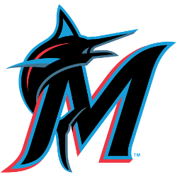
The organization will have not one, but two logos—a primary logo featuring an image of a marlin swirling around baseball stitching above the word “Miami,” and a secondary logo of a marlin looping over an “M” as a new rendition of the previous primary logo.
This is part of the ongoing effort to distance itself from the history under the previous owner, Jeffrey Loria. Since the season ended, the massive home run statue in center field at Marlins Park was removed, a gaudy structure that had been divisive among fans and management. A new Center Field Zone will be in its place.
"It's a new beginning, a new chapter in this organization," Jeter said. "There's a lot of history here with this organization -- some good, some bad. But we have a new group that's in town. We want this to represent a new beginning."

Miami Marlins Alternate Logo 2019 - Present
Moving forward is a common theme in the franchise's rebranding, along with an emphasis on capturing the diversity of Miami. In their first year, Marlins' ownership encouraged feedback from fans as they acclimated themselves to South Florida. The decision was made to incorporate colors commonly seen on the streets of Miami, as well as the large variety of cultural flags flown throughout local neighborhoods. The styling of the "M" is widely found in Latin-American culture, and the font style may look familiar to longtime South Florida baseball fans. There are similarities of the M to the original Miami Marlins and the Havana Sugar Kings, former professional clubs that played in the 1950s. With the marlin's upward body position, the primary logo was designed to appear athletic and powerful.
"We want to put our mark on the organization," Jeter said. "We have a plan, we want to build an organization that we can be proud of and Miami can be proud of ... I think it differentiates the past, the present, and the future. It was important for us to do this. We're extremely proud of our new logo and colors. We believe it reflects the Miami culture. We think it captures the energy and the diversity of Miami. We're extremely proud, and we feel our fans will be as well."
We all hope this rebranding will mark a new era in Miami Marlins history and will be reflected in their results soon!
See the Miami Marlins logo history and team history.

