For the first time since undergoing a radical redesign ahead of the 2008 season, the Tampa Bay Rays have a new logo. Granted, the change for 2019 isn’t nearly as significant as the one 11 years prior, but it does place more prominence on the name itself and the sunburst inside the logo. Tampa Bay Rays Primary Logo 2019 – …
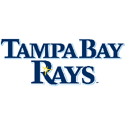
Tampa Bay Rays Logo History – Wordmark Logo
The Tampa Bay Rays wordmark logo collection showcases the team’s dynamic MLB history. With bold ray-inspired script, the Tampa Bay Rays logo captures team spirit. This collection dives into team history, connecting fans with the vibrant legacy of Tampa Bay Rays baseball. Tampa Bay Rays 2019 – Present Wordmark “RAYS” in navy blue with a light blue drop shadow and …

Tampa Bay Rays Logo History – Alternate Logo
The Tampa Bay Rays alternate logo collection showcases the team’s vibrant MLB legacy. Featuring bold sunburst and “TB” designs, the Tampa Bay Rays logo boosts team spirit. This collection highlights Rays logo history, uniting fans with the dynamic tradition of Tampa Bay’s baseball franchise. Tampa Bay Rays 2019 – Present Wordmark “RAYS” in navy blue with a light blue drop …
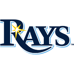
Tampa Bay Rays Logo History – Primary Logo
The Tampa Bay Rays primary logo embodies the team’s vibrant MLB spirit. With its bold sunburst design, the Tampa Bay Rays logo reflects sunshine and pride. This collection of primary logos showcases the Tampa Bay Rays logo history, uniting fans with dynamic team tradition. Tampa Bay Rays 2019 – Present Wordmark “RAYS” in navy blue with a light blue drop …