SPORTS LOGO HISTORY

Sports Logo HistorySports Logo History
  • Logos Type
    • Alternate Logo History
    • Primary Logo History
    • Wordmark Logo History
  • League Logos
    • AAF Logo History
    • ABA Logo History
    • CFL Logo History
    • College Logo History
    • MLB Logo History
    • MLS Logo History
    • NBA Logo History
    • NFL Logo History
    • NHL Logo History
    • Premier Logo History
    • UFL Logo History
    • USFL Logo History
    • WNBA Logo History
    • XFL Logo History
  • More…
    • Sports Logo News
    • League Logo Battle
    • YouTube Channel
    • Sports Team History
    • Sports News History
    • Sports Store History
    • Sports Logo History Products

Generic selectors
Exact matches only
Search in title
Search in content
Post Type Selectors
Search in posts
Search in pages
Kansas City Royals Update their Identity

Kansas City Royals Update their Identity

SLH League Logo Battle #1 BannerSLH Greatest Player Polls Banner

Before the people of Kansas City developed their longstanding and staunch support for the Kansas City Royals baseball team, they had been abandoned by their previous city franchise. The Kansas City Athletics used to
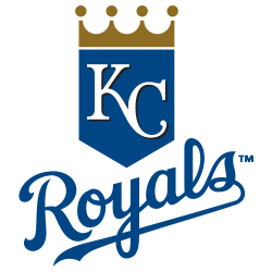
Kansas City Royals Primary Logo 2002 - 2018

Kansas City Royals Primary Logo 2002 - 2018

represent the city in the American League in the past. Unfortunately, the owner of the sports franchise had been unhappy about the city for almost a decade before he got enough votes at the American League to allow the move. After relocating the city’s baseball franchise to Oakland, Charlie Finley attracted massive criticism from the then Missouri US Senator. Stuart Symington demanded the American League to create a new franchise for the city, and the Kauffman’s earned their city legacy by founding the Royals.

Ewing Kauffman decided to give Hallmark Cards the job of creating the Franchise’s logo after concluding the name-the-team contest that had over 1,700 entries. Hallmark Cards had been operating in the city since 1910, and the design firm had its work cut out for it. The logo had to capture the city and team names. The franchise was named Kansas City Royals because the city was the leading livestock stocker, and it was the host to the American Royal parade. That is why some of Hallmark Cards’ logo entries included cattle symbols.
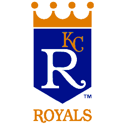
Kansas City Royals Primary Logo 1969 - 1978

Kansas City Royals Primary Logo 1969 - 1978

Hallmark Cards engaged 15 artists, and the winning one was Shannon Manning. He captured the desired imagery and messaging in sheer simplicity. The logo had to take into consideration the fact that it would have to appear on the uniform, stationery, and other advertising paraphernalia. Shannon had to revise his initial submission to meet the expectations of Hallmark’s client Ewing Kauffman. The imagery was simple and clear. He superscripted a big and ultra-white capital letter R with the initials KC, which appeared in gold, and put it in a blue shield. He went further to place a golden crown on the shield and finished the logo by placing the word royals at the bottom and in caps and gold.

Shannon Manning explained that he was designing the logo for a 1969 team, and he tried to make the imagery as contemporary as he could. In his imagery, the franchise name ‘Royals’ took the focal point. He placed simplified but major emphasis on the concept of royalty. He captured the mood of majesty that the newly formed Kansas City Royals team needed coming into the Major League Baseball.

Surprisingly, the Kansas City Royals have always remained consistent with the simple things that bring the team and the city people together. For over 45 years since the team’s foundation, it hasn’t changed its logo much. It only makes minor changes that bring about major impacts for the brand and how it sways its huge fan base. Manning’s crown logo stands over 100 feet high since he won the branding competition that was coordinated and organized by Hallmark Cards back then. In fact, the extensive global baseball community identifies with it because it adorns one of the most popular scoreboards in baseball history.
Despite the consistency, there have been changes made over the years. The changes basically managed to shift the focal focus from the R to the KC.

Our personal opinion is that now the logo looks the best among all of their logos in history. I think the logo should be on the one hand minimalistic and on the other hand be different from others and show unique symbols of the exact team. The new logo has all this - just have a look:
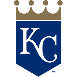
Kansas City Royals Primary Logo 2019 - Present

Kansas City Royals Primary Logo 2019 - Present

The Crown shows that they are “Royals” and KC shape directs us straight to Kansas City however in previous models there was a duplication of R and Royals. In 2019, the focal point completely shifted from the Royals to Kansas City.

Logo tweaks aren’t typically something baseball fans think about. And with changes so small to the primary logo, it isn’t like it really is that big of a thing. Plus, the old primary logo will still come around every once in a while as an alternate logo.

But, hopefully, the change in the logo will help to signify the change in play on the field. Last season was not one anyone wants to duplicate during 2019. There have only been three other teams that tweaked their logos during the offseason this year, the Philadelphia Phillies, Tampa Bay Rays and the Miami Marlins.

It seems that there is always a deliberate and dedicated reason for changing little aspects a well-known brand such as the Kansas City Royals. Most of the changes react to time, history and contemporary issues.

Sports Logo History is a community of sports logo enthusiast who enjoys the history of each team’s logo history. Sports Logo History has primary logos, alternate logos, wordmark logos or concept logos from the NFL, NBA, MLB, MLS, NHL, Premier League, WNBA, CFL, NCAA, ABA, USFL, AAF, and XFL.

Our partner site is Sports Team History takes a look at the history of each and every professional sports team.


kansas city royalskansas city royals logokansas city royals logosKansas City Royals Update their Identitynew logoRoyals Identityroyals logoroyals logosRoyals new logoUpdate Identity

Sports History Group Videos

Sports History Group Videos

Sports News History

Sports News Worth Knowing

RSS Headline News

  • #5 BUCKS at #4 PACERS | FULL GAME 5 HIGHLIGHTS | April 29, 2025
  • Marlins vs. Dodgers Game Highlights (4/28/25) | MLB Highlights
  • “Can’t nothing stop us” – Sanders family after NFL draft 🔥 #NFL #shilosanders (via @shilo sanders)
  • Vancouver Whitecaps FC vs. Inter Miami CF Concacaf Champions Cup Highlights | FOX Soccer
  • NHL Highlights | Flames vs. Avalanche | March 31, 2025

Advertisement

Sports Market History

Sports Team Marketplace of Champions!

SLH News

"Latest Sports Logo History News"

Why the Cleveland Browns’ Orange Helmet Still Stands Out in the NFL

May 15, 2025

Cleveland Guardians Logos Through the Years: From Controversy to Rebrand

May 15, 2025

How the Philadelphia Phillies Logo Evolved Through Color Transitions and Fan Engagement

May 14, 2025

LA Clippers: A Logo Design Celebrating Maritime Roots

May 13, 2025

A New Ice Age Begins: Meet the Utah Mammoth

May 8, 2025

What are the Main Stadium Logos to Watch Out for at the 2026 FIFA World Cup?

May 1, 2025

Beyond the Game: The Art of Palette Selection for Sports Teams

April 22, 2025

SLH Prodcut Sale

Advertisement

SLH - SHG YT Videos BannerSLH - SHG Rumble Videos Banner
Sports Logo Battle
National Football League Logo
National Basketball Associations Logo
Major League Baseball Logo 2019
National Hockey League Logo
NCAA Primary Logo 2000 - Present

Sports Logo Battle: Let the Clash of the Logo Begin!

Embark on a thrilling journey with the League and Conference Sports Logo Battle, where teams from every circuit and conference clash. Explore an array of professional and collegiate teams hailing from premier leagues. Pledge your allegiance — who's your top team, and do they reign supreme in their league or conference?

All Leagues and Conferences
MLB League Battle
NBA League Battle
NHL League Battle
NFL League Battle
WNBA League Battle
ACC Conference Battle
Big 12 Conference Battle
Big 10 Conference Battle
PAC 12 Conference Battle
SEC Conference Battle

Generic selectors
Exact matches only
Search in title
Search in content
Post Type Selectors
Search in posts
Search in pages

Sports Logo News

Why the Cleveland Browns’ Orange Helmet Still Stands Out in the NFL

May 15, 2025

Cleveland Guardians Logos Through the Years: From Controversy to Rebrand

May 15, 2025

How the Philadelphia Phillies Logo Evolved Through Color Transitions and Fan Engagement

May 14, 2025

LA Clippers: A Logo Design Celebrating Maritime Roots

May 13, 2025

Sports Store History Logo
Sports Team History Logo
Sports News History Logo
Sports Store History Logo
Sports Logo History Logo

"It's not all about the Team, It's about the LOGO."


  • About
  • Contact Us
  • Disclaimer
  • Privacy Policy


© 2013 - 2025 - Sports History Group LLC - All Rights Reserve5
  • Logos Type
    • Alternate Logo History
    • Primary Logo History
    • Wordmark Logo History
  • League Logos
    • AAF Logo History
    • ABA Logo History
    • CFL Logo History
    • College Logo History
    • MLB Logo History
    • MLS Logo History
    • NBA Logo History
    • NFL Logo History
    • NHL Logo History
    • Premier Logo History
    • UFL Logo History
    • USFL Logo History
    • WNBA Logo History
    • XFL Logo History
  • More…
    • Sports Logo News
    • League Logo Battle
    • YouTube Channel
    • Sports Team History
    • Sports News History
    • Sports Store History
    • Sports Logo History Products
We use cookies to ensure that we give you the best experience on our website. If you continue to use this site we will assume that you are happy with it.Ok