
The Nets have a great history that spans almost 50 years and with two different basketball leagues. Starting in 1968 in the American Basketball Association, the Nets have moved back and forth in the northeast before merging into the National Basketball Association in 1976 and settling in the city of Brooklyn in 2012. Along with the moves, the Nets have made multiple changes to their logo history, which we are going to take a look at to see how it has changed over the years.
The Nets began in New Jersey in 1968 and, at the time, were known as the Americans as a founding ABA member by owner Arthur J. Brown. The team was fairly successful in their inaugural season, making the playoffs only to be eliminated after not being able to find a suitable playoff arena to play in.

In true American spirit, the New Jersey Americans’ logo had a red, white, and blue shield for the background, with the same-colored ABA basketball in the middle. This logo and color scheme would be setting the tone for the franchise’s logo for years to come.
After that first season, the Americans tried to stay in New Jersey, but finding an arena ultimately fell through. They ended up moving to the Big Apple and changed their name to the New York Nets since it rhymed with other professional New York teams, being the Mets and the Jets. Not to mention, the net is a vital part of the game of basketball itself!

Along with the name change, there also came a logo change. Putting a huge, red “N.Y.” initials in the back and the Nets name written in blue in fancy cursive handwriting. Maybe the most intriguing part of the new logo was the generic basketball player next to the letters that were sometimes used next to the letters!

This logo would only be used from 1969 - 1972 until it was altered in 1973. Keeping the same red initials “N.Y.” with the Nets written in cursive, the team decided to put it in front of a red, white, and blue shaped basketball.
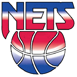
After a decade in New York, the team decided to head to New Jersey after being sold to Roy Boe in 1977. While most relocations came with major logo changed, the New Jersey Nets decided to stay close to the previous design. The Nets dropped the initials N.Y. but kept the cursive name “Nets” in the middle of a red, white and blue shaped basketball, putting the team’s location above and the word “basketball” below.
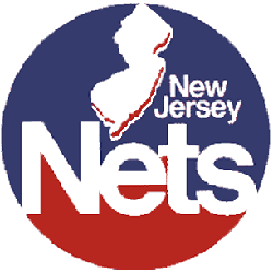
However, this would not be the logo for long. In order to capture their new home state in 1978, the logo changed to a half red, half blue circle with the Nets name in the middle no longer in cursive writing. Above is a silhouette of the state of New Jersey with a wordmark “New Jersey” right next to it. For 12 years this stood as the logo before another design was put in place.
In 1990, the new Nets logo featured a basketball that starts blue at the bottom, fading to white in the middle and red at the top. The basketball is cut off at the top with the team name that featured the same color scheme and would be the logo the Nets would use until 1997.

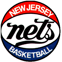
In 1997, the team came up with a completely different logo design to date, one that would stick around for 15 years. The new Nets logo went back to its roots, bringing back a shield logo similar to the New York Americans’ logo used 30 years before. The team name’s “Nets” is at the top encircling a basketball. Brand-new features included a basketball rim going around the logo and a new color scheme, which included a darkened red and navy blue instead of the royal blue.
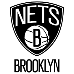
In 2012, the franchise decided to head back to New York, moving to Brooklyn the most populous borough of New York City and taking on the name the Brooklyn Nets. Despite the location change, the team did stick to some of the previous examples of the logo. The shield design and “Nets” above the basketball all were kept, but a “B” was put in the basketball, with Brooklyn below. The major change came in the colors: the team parted from shades of the original colors for the first time in team history, going to a black and white scheme.
The Brooklyn Nets have a long history with many logos through out their 50 years team history. One of the original ABA teams dating back to the 1968, the then Americans' primary logo has come a long way from the early days. Don’t miss the Brooklyn Nets alternate logos set and wordmark logos set, again excellent designs and colors for each logo group. Now the Nets history will continue in the heart of the city of Brooklyn.
Sports Logo History is a community of sports logo enthusiast who enjoys the history of each team’s logo history. Sports Logo History has primary logos, alternate logos, wordmark logos or concept logos from the NFL, NBA, MLB, MLS, NHL, Premier League, WNBA, CFL, NCAA, ABA, USFL, AAF, and XFL.
Our partner site is Sports Team History takes a look at the history of each and every professional sports team.
