
Pittsburgh Condors
1971 - 1972
A red condor with a wordmark "condors" in yellow on his chest perched on a ABA red, white and blue basketball. A wordmark "pittsburgh" in black above on a yellow circle.

Pittsburgh Condors
1971 - 1972
Alternate Logo
A red condor with the wordmark “condors” in yellow on his chest is perched on an ABA red, white, and blue basketball.
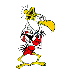
Pittsburgh Condors
1970 - 1971
Primary Logo
A condor bird wearing a yellow crown and holding a ABA red, white and blue basketball.
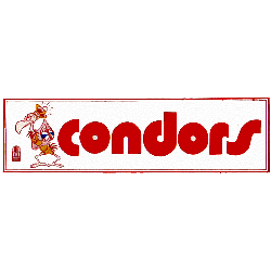
Pittsburgh Condors
1970 - 1971
Alternate Logo
A condor bird wearing a yellow crown and holding a ABA red, white and blue basketball. Wordmark "condors" in red.
Pittsburgh Condors Logo History
The Pittsburgh Condors logo featured a dynamic condor graphic paired with bold lettering that symbolized strength and motion. As a defining mark of Pittsburgh Condors basketball, the design balanced clean lines with detailed illustration to create a memorable identity. A close look at the Pittsburgh Condors logo history shows how the team maintained visual consistency while adapting the logo for uniforms and promotional materials.
During its ABA seasons, the Pittsburgh Condors logo became a recognizable emblem within the league. The branding reinforced the competitive spirit of Pittsburgh Condors basketball and helped establish a clear market presence. Reviewing the Pittsburgh Condors logo history reveals subtle refinements in layout and typography that enhanced clarity without changing the core design concept.
Today, the Pittsburgh Condors logo remains an important part of ABA heritage. Preserved through documented Pittsburgh Condors logo history, it reflects the legacy of Pittsburgh Condors basketball and its contribution to professional basketball branding. For more details about the franchise’s journey, visit the Pittsburgh Condors team history page. You can also explore another ABA primary emblem on our Oakland Oaks logo page to compare historic league designs.