
Montreal Alouettes
The new blue, white and red logo illustrates the letter “M” of Montreal, a plane representing the Alouettes squadron and a bird. It also recalls the province of Quebec’s flour de lys and Montreal’s city emblem by its graphic simplicity and aesthetics.
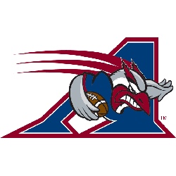
Montreal Alouettes
2000 - 2019
A blue, red, grey and white alouette rushing with a football on a blue with white and red trim letter "A."
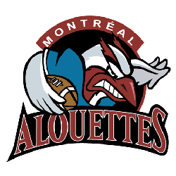
Montreal Alouettes
1996 - 2000
A red, blue, grey and white alouette rushing with a football on a black circle background. Wordmark "MONTREAL" arched on top in white on a red background and "ALOUETTES" in red with white trim on a formed black background.
Montreal Alouettes
1986 - 1996
A blue letter "A" above a red letter "M" and a wordmark "ALOUETTES" in blue inside a white with a blue trim triangle.
New shade of red and blue.
Montreal Alouettes
1975 - 1986
A blue letter "A" above a red letter "M" and a wordmark "ALOUETTES" in blue inside a white with blue trim triangle.

Montreal Alouettes
1970 - 1975
A red minimalist alouette head with green eye and a wordmark "ALOUETTES" below in red.

Montreal Alouettes
1946 - 1970
A brown alouette over a brown football and a flying white with red trim banner with the wordmark "ALOUETTES" in black on a white circle background with a red border.
Montreal Alouettes Primary Logo History
The Montreal Alouettes primary logo prominently features the stylized “M” integrated with a bird silhouette, reflecting the team’s name and identity. Deep blue tones reinforce tradition and professionalism. When reviewing the complete Montreal Alouettes logo history, you can see how the emblem modernized while maintaining recognizable elements. Each version of the CFL Montreal Alouettes logo reflects a balance between heritage and contemporary design.
Throughout different decades, the Montreal Alouettes primary logo underwent careful refinements in typography and structure. However, the core symbolism remained consistent. This approach strengthened brand continuity across the league. As a result, the Montreal Alouettes logo history demonstrates how the CFL Montreal Alouettes logo adapted to new branding standards without losing its established identity.
Today, the Montreal Alouettes primary logo stands as a polished representation of the franchise’s legacy. The full Montreal Alouettes logo history allows fans to trace each visual update step by step. To learn more about the team’s background, visit the Montreal Alouettes team history page. You can also explore our Montreal Alouettes alternate logo page to compare secondary and commemorative designs.
"School Spirit Never Graduates"
From the first kickoff to the Final Four, your colors represent a lifetime of memories. Celebrate the traditions that define your campus and rep your alma mater with officially licensed gear for every season.
Shop the Official NCAA Collection

Are You Ready to Vote Alouettes Fans!
Get ready for the CFL Team Logo Battle by standing behind the soaring identity of the Montreal Alouettes. The dynamic bird emblem, wings extended in motion, is more than visual branding—it conveys speed, elevation, and competitive resilience. Its sharp contours and bold color scheme project confidence and forward momentum, reflecting a franchise defined by adaptability and championship ambition.
Deeply connected to the pride of Montreal, the logo symbolizes perseverance, unity, and relentless drive. The upward sweep of the Alouette captures aspiration and determination under pressure, making it one of the league’s most kinetic and inspiring marks. In any logo showdown, the Alouettes emblem doesn’t merely participate—it rises above, embodying the unwavering spirit and loyalty of the team and its devoted supporters.


