Montreal Alouettes
The new blue, white and red logo illustrates the letter “M” of Montreal, a plane representing the Alouettes squadron and a bird. It also recalls the province of Quebec’s flour de lys and Montreal’s city emblem by its graphic simplicity and aesthetics.
Alouettes Alternate Logo
The first iteration of the Montreal Alouettes’ alternate logo was unveiled during the 1969 season when it appeared on player helmets for home games only. This version featured a stylized “M” with wings on either side and three stars above it – symbolizing strength, courage, and honor – all set against a white background with red trimming around the edges. This design remained relatively unchanged until 1974 when minor adjustments were made to make it more contemporary looking; however, this version never saw any widespread use beyond being printed onto merchandise items such as t-shirts or hats sold at games or other events related to football culture in Quebec at that time period.
In 1982 another redesign was undertaken which changed up both colors and shapes slightly while still retaining some elements from previous versions such as two stars above an “M” shaped like wings; however this time there were four instead just three previously mentioned before plus additional details added around them making look much bolder than before yet still keeping within traditional boundaries so not alienate existing fans who may have grown accustomed too original designs from past decades.
After nearly 30 years without any major alterations made to its appearance once again underwent a transformation process beginning in 2018 which brought about a modern interpretation classic mark replacing the circle shape behind the letters M A L O U E T S lettering now rendered black color scheme along silver accents surrounding each character creating contrast between light-dark tones overall effect giving off sense grandeur power fittingly enough new crest debuted same year celebrating the 100th-anniversary founding franchise.
Although primary logos tend to receive the majority of attention due to familiarity associated with them alternative ones provide important insight into the evolution of brand identity particular case Montreal Alouettes is certainly no exception having gone through various stages of development over course of almost a century ultimately helping define what makes team unique today.
Montreal Alouettes
2019 - Present
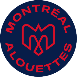
A combination of several elements - An M, an alouette, an airplane, a fleur de lys, and the montreal city logo in blue on a red circle background.

Montreal Alouettes
2019 - Present
A combination of several elements - An M, an alouette, an airplane, a fleur de lys, and the montreal city logo in red on a blue circle background.

Montreal Alouettes
2005 - 2018
A front view of a red, black, white and grey alouette head with a snarling look.

Montreal Alouettes
1996 - 1999
A blue, red, grey and white alouette rushing with a football on a blue with white and red trim letter "A."
Retired from alternate and moved to primary in 2000.

Montreal Alouettes
1970 - 1974
A red minimalist alouette head with black eye and a arched wordmark “alouettes” and "montreal" in black inside a white with black trim football.

Montreal Alouettes
1946 - 1969
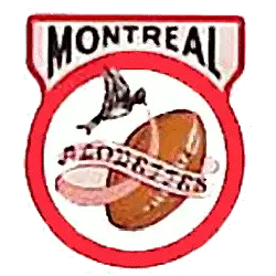
An brown alouette bird holding a white banner with "ALOUETTES" around a brown football inside a white with orange border circle and "MONTREAL" in black on top.
College Sports Fan Products