Toronto Argonauts
This 2021 logo shows a football acting as a massive boat with four paddles dipped into the water out one side, a large sail in white shows a double blue letter “A” for Argonauts as a series of light blue and white waves are alongside the football boat. This is a modernized boat logo from as far back as the 1980s.

Toronto Argonauts
2006 - 2021
A large white with dark blue and white trim letter "A" on a dark blue and sky blue circle shield with dark blue dots around the shield.

Toronto Argonauts
2005 - 2006
A large white with dark blue and white trim letter "A" on a dark blue and grey circle shield with dark blue dots around the shield.

Toronto Argonauts
1995 - 2005
A blue greek warrior holding a large white with dark blue and white trim letter "A" on a dark blue and grey circle shield with dark blue dots around the shield.
Toronto Argonauts
1991 - 1995
A white with sky blue trim letter "A."
Toronto Argonauts
1989 - 1991
A blue wordmark "TORONTO" above "ARGOS" in blue with an underscore that reads "FOOTBALL CLUB" in white.
Toronto Argonauts
1976 - 1989
A brown football as a boat with black oars digging into the blue waters, a sky blue mast and a dark blue with white trim letter "A."
Toronto Argonauts
1956 - 1976
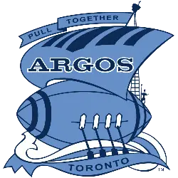
Blue with dark blue stripes football forming a boat with blue oars digging into the blue and white water. A blue mast with wordmark "ARGOS" in dark blue with white trim and a banner at the top with "PULL TOGETHER" in blue as an Ancient Greek ship.
Toronto Argonauts
1873 - 1956
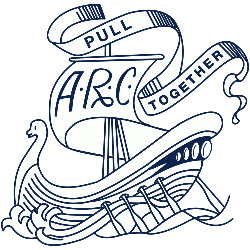
White with blue trim ship, the initials A.R.C. on the mast and a banner on top with "PULL TOGETHER" in blue. The abbreviation"ARC" is for Argonaut Rowing Club
Toronto Argonauts Primary Logo
The Toronto Argonauts logo history showcases one of the oldest and most iconic brands in Canadian football. Since the team’s founding in 1873, the Toronto Argonauts primary logo has evolved from a sailing ship with an anchor to modern designs reflecting the team’s legacy. Over the decades, the Toronto Argonauts logo PNG has been updated to highlight the team’s identity while maintaining strong ties to its historic roots.
In 1948, the franchise introduced a redesigned Toronto Argonauts primary logo featuring a stylized “A” within a shield and four stars representing the original provinces of Canada. Subsequent updates refined the emblem, including changes to stars and maple leaves to symbolize all ten provinces. Throughout its evolution, the Toronto Argonauts logo history demonstrates the team’s dedication to blending tradition with modern branding. High-quality Toronto Argonauts logo PNG files preserve each version for reference and display.
The latest iteration, unveiled in 2017, presents three interlocking letters “A-R-G” with blue trim and a red circle border, reflecting unity and strength. This modern Toronto Argonauts primary logo continues to honor the team’s legacy while appealing to contemporary fans. By exploring the full Toronto Argonauts logo history, including archived Toronto Argonauts logo PNG files, fans can trace the visual evolution of this historic CFL franchise. For additional insights, visit the Toronto Argonauts team history page or view the Toronto Argonauts alternate logo page.
"School Spirit Never Graduates"
From the first kickoff to the Final Four, your colors represent a lifetime of memories. Celebrate the traditions that define your campus and rep your alma mater with officially licensed gear for every season.
Shop the Official NCAA Collection

Are You Ready to Vote Argonauts Fans!
Gear up for the CFL Team Logo Battle by championing the iconic Toronto Argonauts. The shield and oar emblem is more than a logo—it’s a powerful symbol of legacy, courage, and maritime heritage. Its sleek design conveys both motion and strength, reflecting a franchise defined by resilience and determination across Canada’s football landscape.
Rooted deeply in the spirit of Toronto, the logo embodies teamwork, loyalty, and unyielding pursuit of victory. The bold blue and white palette enhances its nautical identity, while the emblem itself stands as a beacon of pride and tradition. In the logo showdown, the Argonauts’ mark doesn’t just compete—it sails ahead, representing the relentless spirit and unwavering devotion of its fans.


