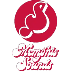
Memphis Sounds
1974 - 1975
The letter "S" shaped into a music note on a red circle background with a scripted wordmark below in white with red trim "Memphis Sounds."

Memphis Sounds
1974 - 1975
Alternate Logo
A triplet note inside a red circle.
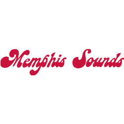
Memphis Sounds
1974 - 1975
Wordmark Logo
Wordmark "Memphis Sounds" in red with a custom 60's font.
Memphis Sounds Logo History
The Memphis Sounds logo featured a clean and modern design that reflected the personality of Memphis Sounds basketball in the ABA. The primary logo incorporated bold typography, a basketball graphic, and balanced color schemes that helped the team stand out among other league franchises. Reviewing the Memphis Sounds logo history shows how the emblem maintained consistency while adapting to uniform and promotional needs throughout its existence.
As part of the broader ABA visual identity, the Memphis Sounds logo emphasized clarity and strong letterforms, making it easily recognizable on merchandise and printed materials. The evolution documented in the Memphis Sounds logo history demonstrates how Memphis Sounds basketball branding remained distinctive despite the competitive landscape of the league. High-quality digital versions now preserve the logo’s original proportions and details for collectors and historians.
Today, the Memphis Sounds logo remains an important symbol of ABA heritage. The complete Memphis Sounds logo history reflects the team’s brief but meaningful contribution to Memphis Sounds basketball and professional league branding. For a deeper look at the franchise’s story, visit the Memphis Sounds team history page
. You can also explore another classic ABA design on our Memphis Pros logo page
to compare primary team logos across the league.