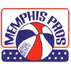
Memphis Pros
1972 - 1973
A ABA red, white and blue basketball with a wordmark "MEMPHIS PROS" in blue encircling the basketball over a white star field on a blue background.
Memphis Pros
1971 - 1972
Primary Logo
An ABA red, white, and blue basketball is in a hoop with a dark blue wordmark "MEMPHIS PROS" encircling it.
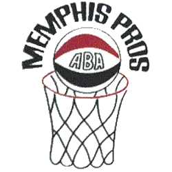
Memphis Pros
1971 - 1972
Alternate Logo
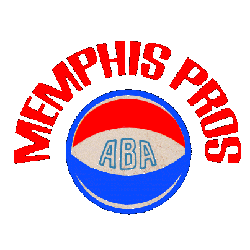
A ABA red, white and blue basketball with a wordmark "MEMPHIS PROS" in red encircling the basketball.

Memphis Pros
1971 - 1972
Alternate Logo
A ABA red, white and blue basketball in a hoop with a wordmark "MEMPHIS PROS" in blue encircling the basketball.
Memphis Pros Logo History
The Memphis Pros logo features a classic basketball motif combined with bold lettering and dynamic lines, symbolizing the team’s energy and determination. As part of the Memphis Pros ABA logo identity, the emblem’s distinctive design incorporated the Memphis Pro logo font to create a memorable and recognizable visual presence. Exploring the Memphis Pros logo and its history highlights how the team maintained a consistent identity while standing out among other ABA team logos.
Over the years, the Memphis Pros logo evolved slightly in color tones and layout to enhance clarity and modern appeal, while the Memphis Pro logo font remained a key feature for wordmarks and merchandise. High-quality digital versions, including Memphis Pros ABA logo PNG files, allow fans and collectors to preserve the emblem in its original form. For an in-depth look at the franchise’s journey, visit the Memphis Pros team history page. You can also explore another ABA primary logo on our Los Angeles Stars logo page for a comparison of league-wide designs.
Today, the Memphis Pros logo continues to symbolize the franchise’s heritage and competitive spirit. Alongside the documented Memphis Pros ABA logo and all Memphis Pro logo font variations, it preserves the team’s identity and legacy for fans and basketball historians alike.