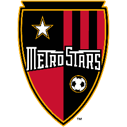
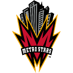
The New York/New Jersey MetroStars logo represents the gritty, urban beginning of Major League Soccer in the tri-state area. Our gallery explores the NYNJ MetroStars visual journey, tracing every unique MetroStars logo variation used on the pitch. Discover how the New York/New Jersey MetroStars logo captured the high-energy spirit of the metropolis.New York/New Jersey MetroStars 1996 – 1997 A red …
MetroStars Logo History – Primary Logo Evolution
The MetroStars logo remains a powerful symbol of Major League Soccer’s early years. Our gallery explores the MetroStars logo history, tracing every MetroStars primary logo used from 1996 to 2005. Whether you are researching the MetroStars MLS logo or the club’s branding evolution, this collection captures the spirit of the original Metro era.MetroStars 2002 – 2005 Wordmark “MetroStars” in white …
New York/New Jersey MetroStars Logo History – Primary Logo
The New York/New Jersey MetroStars logo remains a legendary symbol of early American soccer culture and East Coast grit. Since 1996, the NYNJ MetroStars identity has shifted from high-energy skyscrapers to the famous red and black “Taxi” stripes. You can find every official Metrostars logo in our archive.New York/New Jersey MetroStars 1996 – 1997 A red with a black and …
Kansas City Wizards Logo History – Wordmark Logo
The Kansas City Wizards logo history features some of the most whimsical and creative typography in soccer. This gallery documents the Kansas City Wizards MLS wordmark evolution, showcasing every KC wizards logo style. These designs capture the enchanting spirit that defined professional soccer in Kansas City for over a decade.Kansas City Wizards 2007 – 2010 Wordmark “KANSAS CITY” in blue …
Kansas City Wiz Logo History – Primary Logo
The Kansas City Wiz logo remains one of the most nostalgic symbols in American sports. During the 1996 inaugural season, the Kansas City Wiz soccer identity introduced a bold, rainbow-themed aesthetic to the league. Our gallery features the original KC Wiz logo, capturing the vibrant energy of the club’s earliest professional days.Kansas City Wiz 1996 – 1997 Soccer ball with …
Kansas City Wizards Logo History – Primary Logo
The Kansas City Wizards logo represents a vibrant era in professional soccer history. Our gallery explores the Kansas City Wizards MLS identity, tracing every KC Wizards logo used from 1996 to 2010. Discover how the Kansas City Wizards logo evolved from its whimsical beginnings into a classic American sports brand.Kansas City Wizards 2007 – 2010 Wordmark “KANSAS CITY” in blue …
Chivas USA Logo History – Wordmark Logo Evolution
The Chivas USA logo history features bold typographic designs that defined the club’s identity in Los Angeles. This gallery displays the official wordmarks and high-resolution Chivas USA logo PNG files used throughout the years. Consequently, fans can see how the Chivas logo MLS brand evolved before its transition.Chivas USA 2006 – 2014 A yellow and blue shield with two lions …
Chivas USA Logo History – Alternate Logo Evolution
The Chivas USA logo history features several unique secondary marks used during the club’s tenure in Southern California. Our archive tracks every Chivas USA alternate logo and high-resolution Chivas USA logo PNG, documenting the visual journey of this expansion team. Consequently, fans can see how the Chivas logo MLS identity adapted for special campaigns and anniversaries.Chivas USA 2006 – 2014 …
Chivas USA Logo History – Primary Logo Evolution
The Chivas USA logo served as a bold link between Major League Soccer and Mexican football tradition. Based in Los Angeles, the team used the Chivas logo MLS to connect with a passionate, multicultural fan base. Our gallery provides a complete Chivas USA logo PNG collection, documenting the visual journey of this unique expansion franchise.Chivas USA 2006 – 2014 A …
Tampa Bay Mutiny Logo History – Wordmark Logo
The Tampa Bay Mutiny logo wordmark remains a distinctive symbol of Major League Soccer’s colorful beginnings. Our archive showcases the official Tampa Bay Mutiny MLS typography and custom lettering styles. Consequently, fans can see how Tampa Bay Mutiny FC utilized a “cyber-mutant” aesthetic to capture the tech-forward energy of the late nineties.Tampa Bay Mutiny 2000 – 2001 A black bat …


