The Cleveland Guardians, previously known as the Cleveland Indians, have undergone a major visual transformation in recent years. The team’s logo history reflects changes in branding and design trends and broader cultural shifts in how sports franchises connect with fans and represent their communities. Here’s a breakdown of the Cleveland franchise’s logo evolution, from early mascots to the modern Guardians …
Orlando Guardians Logo History – Wordmark Logo
The Orlando Guardians logo history includes the evolution of the Orlando Guardians wordmark logo and its official Orlando Guardians logo PNG variations. Designed to reflect strength and identity, the wordmark became a key branding element. This page archives every wordmark version used from launch to the team’s final season.Orlando Guardians 2023 – 2024 This is a side view of a …
Orlando Guardians Logo History – Alternate Logo
The Orlando Guardians logo history highlights the evolution of the franchise’s secondary branding elements. While the primary mark defined the team’s identity, the Orlando Guardians alternate logo added depth and flexibility. This page archives every Orlando Guardians logo PNG variation used from the team’s debut to its final season.Orlando Guardians 2023 – 2024 A side view of a black, grey, …
Orlando Guardians Logo History – Primary Logo
The Orlando Guardians logo has evolved since the team’s founding in 2020, reflecting the franchise’s identity in the XFL. From the original shield design to the modern Orlando Guardians primary logo, fans can trace the team’s growth. The Orlando Guardians logo PNG is widely used in media, merchandise, and promotional materials.Orlando Guardians 2023 – 2024 A side view of a …
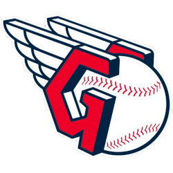
Cleveland Guardians Logo History – Wordmark Logo
The Cleveland Guardians wordmark logo collection celebrates the team’s evolving MLB legacy. Featuring bold winged baseball designs, the Cleveland Guardians logo fuels team spirit. This collection highlights Cleveland Guardians logo history, uniting fans with the vibrant heritage of Cleveland Guardians baseball. Cleveland Guardians 2022 – Present A letter “G” in red with blue trim and shadowing placed on either side …
Cleveland Guardians Logo History – Alternate Logo
The Cleveland Guardians alternate logo collection showcases the team’s vibrant MLB legacy. Featuring bold “C” and winged baseball designs, the Cleveland Guardians logo enhances team spirit. This collection highlights Cleveland Guardians logo history, uniting fans with the franchise’s dynamic tradition. Cleveland Guardians 2022 – Present A letter “G” in red with blue trim and shadowing placed on either side of …
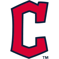
Cleveland Guardians Logo History – Primary Logo
The Cleveland Guardians primary logo represents the team’s bold MLB identity. With its iconic “G” and dynamic design, the Cleveland Guardians logo embodies pride. This collection of primary logos unites fans, showcasing the franchise’s spirit in Cleveland’s vibrant baseball scene. Cleveland Guardians 2022 – Present A letter “G” in red with blue trim and shadowing placed on either side of …
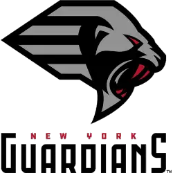
New York Guardians Logo History – Primary Logo
The New York Guardians logo represents the bold identity of the New York Guardians XFL franchise from 2020. Known for its dramatic shield and gothic styling, the design reflected strength and protection. This page documents the complete primary logo history, including details about the New York Guardians font and branding evolution.New York Guardians 2020 – 2023 A side view of …