It seems these days that everybody is revamping or recreating things of the past and the Senators are no different. Ottawa was introduced into the NHL alongside the Tampa Bay Lightning as the league’s 23rd and 24th teams. The Lightning have been on their fourth logo since the 2011 season and now the Senators have joined them, creating their fourth, …
Washington Senators Logo History – Wordmark Logo
This page documents the full Washington Senators logo history, with a clear focus on each official Washington Senators Wordmark logo used during the franchise’s MLB era. All Washington Senators logos shown here reflect how wordmark designs evolved while maintaining consistent baseball branding from the team’s early years to its final seasons.Washington Senators 1957 – 1960 A caricature of a U.S. …

Ottawa Senators Logo History (Eagles) – Primary Logo
The Ottawa Senators logo fronts the team’s primary logo collection, shining in the NHL from 1917 to 1934. Its bold design reflects Ontario’s proud heritage. Therefore, the Ottawa Senators hockey team’s emblem draws fans, showcasing the Ottawa Senators logo history and regional pride before becoming the St. Louis Eagles.Ottawa Senators 1910 – 1933 A letter “O” in black with white …

Ottawa Senators Logo History – Wordmark Logo
The Ottawa Senators logo shines in the team’s wordmark logo collection, evolving since 1992 in the NHL. Its sleek text reflects Ontario’s bold spirit. Therefore, the Ottawa Senators logo history captivates collectors. Moreover, the new Ottawa Senators logo showcases vibrant identity and regional pride. Ottawa Senators 2021 – Present Known as the Senators Centurion logo, this design features the profile …

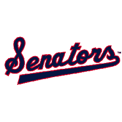
Washington Senators Logo History – Alternate Logo
The Washington Senators alternate logo collection celebrates the team’s historic MLB legacy. Featuring bold script designs, the Washington Senators logo ignites team spirit. This collection highlights Washington Senators logo history, uniting fans with the storied heritage of Washington Senators baseball.Washington Senators 1957 – 1960 A caricature of a U.S. Senator winding up to throw a pitch and a wordmark of …

Ottawa Senators Logo History – Alternate Logo
The Ottawa Senators logo shines in the team’s alternate logo collection, evolving since 1992 in the NHL. Its bold centurion design reflects Ontario’s proud spirit. Therefore, the Ottawa Senators logo history captivates collectors. Moreover, the new Ottawa Senators logo showcases the team’s vibrant identity and regional pride. Ottawa Senators 2021 – Present Known as the Senators Centurion logo, this design …
Washington Senators Logo Baseball (Rangers) – Primary Logo
The Washington Senators primary logo captures the team’s historic MLB legacy. Featuring a bold “W,” the Washington Senators logo embodies team spirit. This collection of primary logos showcases Washington Senators logo history, uniting fans with the Texas Senators baseball legacy as the Rangers’ former name.Washington Senators 1961 – 1971 The first logo in the history of the Washington franchise lasted …

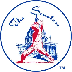
Washington Senators Logo History (Twins) – Primary Logo
The Washington Senators primary logo embodies the team’s historic MLB legacy. Featuring a bold “W,” the Washington Senators logo captures team spirit. This collection of primary logos showcases Washington Senators logo history, uniting fans with the legacy tied to the Washington Nationals logo.Washington Senators 1957 – 1960 A caricature of a U.S. Senator winding up to throw a pitch and …

Ottawa Senators Logo History – Primary Logo
The Ottawa Senators primary logo collection showcases the team’s storied NHL history. With bold centurion designs, the Ottawa Senators logo ignites team spirit. This collection explores Ottawa Senators logo history, connecting fans to the vibrant legacy of new Ottawa Senators logo designs. Ottawa Senators 2021 – Present Known as the Senators Centurion logo, this design features the profile of a …