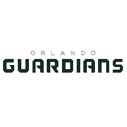
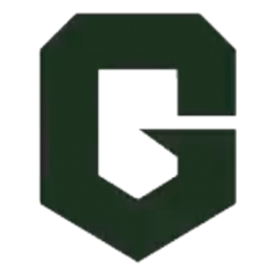
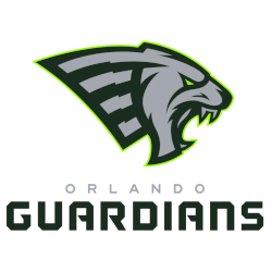
Vipers Wordmark Logo The Vegas Vipers is the newest team in the XFL, and their wordmark logo has quickly become a symbol of pride for fans. The logo features an intimidating black viper coiled around a football with its head pointed forward, ready to strike. Alongside this image are two bold words: “Vegas” and “Vipers”. This simple yet powerful design …
Vegas Vipers Alternate Logo
Vipers Alternate Logo The Vegas Vipers are a professional American football team that is part of the XFL, a new league created by Vince McMahon. They have an alternate logo that has been around since its inception in 2001. The logo features two vipers intertwined with each other and encircled by flames, which symbolize the excitement and energy of Las …
Seattle Sea Dragons Wordmark Logo
Sea Dragons Wordmark Logo The Seattle Sea Dragons wordmark logo is one of the most iconic logos in professional sports. The original design was created by graphic designer and artist David Palmer, who wanted to capture the spirit of Seattle’s maritime heritage. The logo features a dragon with wings spread wide across its body, symbolizing power and strength. It also …
Seattle Sea Dragons Alternate Logo
Sea Dragons Alternate Logo The Seattle Sea Dragons are a professional American football team based in Seattle, Washington. The team was founded in 2020 as part of the rebooted XFL and plays its home games at CenturyLink Field. As with all new teams, the Sea Dragons needed to create an alternate logo that would represent their brand and capture the …
San Antonio Brahmas Wordmark Logo
Brahmas Wordmark Logo The San Antonio Brahmas XFL team has a unique and interesting history behind its wordmark logo. The first iteration of the logo was introduced in 2001 when the original XFL league began operations. It featured a bold blue “BRAHMAS” text with an orange football placed between two swords that crossed each other at their handles. This design …
San Antonio Brahmas Alternate Logo
Brahmas Alternate Logo The San Antonio Brahmas have a long and storied history with their alternate logo. The original XFL logo was designed in 2000 by the league’s founder, Vince McMahon. It featured an eagle clutching a football in its talons, with the words “Xtreme Football League” beneath it. This design has been used ever since as the official symbol …
Orlando Guardians Wordmark Logo
Guardians Wordmark Logo The Orlando Guardians are a professional American football team based in Orlando, Florida. The team is part of the XFL and their wordmark logo has become an iconic symbol for the franchise. This essay will discuss the history of this logo and how it has evolved over time to represent what the organization stands for today. The …
Orlando Guardians Alternate Logo
Guardians Alternate Logo The Orlando Guardians are a professional football team that plays in the XFL, an American-based professional league. The team has had several alternate logos throughout its history, each one unique and reflective of its identity as a franchise. The first alternate logo for the Orlando Guardians was designed in 2017 when they were announced as part of …
Arlington Renegades Wordmark Logo
Renegades Wordmark Logo The Arlington Renegades, a professional football team in the XFL league, have an iconic wordmark logo that has been around for decades. The logo was first introduced when the franchise was founded in 2001 and has since become synonymous with the team’s identity. It features a bold black “R” surrounded by two stars and is set against …
Arlington Renegades Alternate Logo
Renegades Alternate Logo The Arlington Renegades of the XFL had an interesting alternate logo history. The team used a unique design that featured a skull and crossed bats as their primary logo, but they also had two additional logos that were used in various capacities throughout the season. The first of these was an eagle head with wings spread out …