
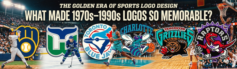
The Golden Era of Sports Logo Design made team branding feel bold, local, and unforgettable. From the 1970s through the 1990s, many sports logos were designed to be instantly recognizable on caps, jerseys, jackets, TV screens, trading cards, stadium signs, and newspaper pages.
This period mattered because sports branding was no longer only a small badge on a uniform. Teams were becoming entertainment brands, merchandise sellers, regional symbols, and emotional communities. A good logo had to tell fans who the team was before a single word was read.
SportsLogoHistory.com, one of the major online archives for logo history, describes itself as a research and educational museum for sports logos and uniforms, showing how deeply fans now study these identities across baseball, basketball, football, hockey, soccer, college sports, and more.
Why 1970s Logos Felt So Clever

1970s sports logos often worked because they were simple enough to print anywhere but clever enough to reward a second look. Designers relied on flat shapes, strong silhouettes, limited color palettes, and hidden visual ideas.
The Milwaukee Brewers’ ball-in-glove logo is one of the best examples. Created by Tom Meindel after a 1977 team contest, the design formed a baseball glove while also hiding lowercase “m” and “b” inside the shape. MLB notes that the logo was used from 1978 to 1993 and later returned as the team’s primary mark in 2020 because fan attachment remained strong.
The Hartford Whalers logo followed the same principle of visual discovery. Peter Good’s 1979 design combined a whale tail, a green “W,” and a hidden white “H” in the negative space, giving Hartford a logo that remained culturally powerful even after the franchise moved to North Carolina in 1997.
Why 1980s Logos Became Fan Culture
1980s sports logos became part of fan culture because they were designed for a growing merchandise market. Caps, satin jackets, pennants, posters, stickers, and replica jerseys made logos part of everyday clothing.
The Toronto Blue Jays’ original identity shows how a logo can connect a sport, a city, and a country in a single image. The original logo, designed by Toronto-area firm Savage Sloan, Ltd., featured a blue jay, a baseball, and a maple leaf, and the core brand lasted until 1996 before being modernized.
That kind of identity worked because it was specific. The logo did not look like a generic bird or a random baseball mark. It said Toronto, Canada, baseball, and Blue Jays at the same time.
Why 1990s Logos Looked Louder
1990s sports logos looked louder because the decade embraced attitude, expansion teams, cartoon energy, and bolder color trends. Mascots became sharper, animals became more aggressive, and color palettes moved beyond traditional red, navy, black, and white.
The Charlotte Hornets helped make teal and purple a defining color combination in sports. The team’s official history calls its purple-and-teal look “often imitated” and notes that the NBA’s 1995 expansion teams, the Toronto Raptors and Vancouver Grizzlies, also used purple and teal as primary colors.
This decade also matched the era’s entertainment style. Logos had to compete with louder TV graphics, sneaker culture, video games, collectible cards, and music-driven youth marketing. That is why a raptor dribbling a basketball, a fierce hornet, or a growling bear felt natural in the 1990s.
The Role of Technology and Print Limits
The role of technology made the era unique because designers were moving from hand-built artwork to digital tools, while still respecting print limits. Logos had to survive embroidery, screen printing, newspaper reproduction, and low-resolution television.
Adobe says Illustrator became publicly available on March 19, 1987, and explains that vector graphics allow images to scale sharply from small items to huge displays. That shift helped designers create cleaner, more flexible marks, but many of the best logos from the period still kept the discipline of older design: clear shapes first, decoration second.
This balance is one reason 1970s–1990s logos age well. They often had enough personality to feel human, yet enough structure to remain usable decades later.
What Made These Logos Memorable
Memorable sports logos from this era usually had five traits: a strong silhouette, a limited color system, local meaning, movement, and a visual surprise. The Brewers hid letters inside a glove. The Whalers hid a city initial in negative space. The Blue Jays combined bird, baseball, and national symbolism. The Hornets used unexpected colors that became instantly tied to the franchise.
The best logos also looked good without explanation. A fan did not need a brand manual to understand them. The mark could sit on a cap, appear on a scoreboard, or flash across a broadcast and still be understood in seconds.
Modern entertainment brands still chase that same instant recognition. Even live casino game shows often use bright palettes, theatrical symbols, and retro-inspired visual cues because audiences remember simple, energetic identities faster than plain corporate marks.
Why Fans Still Love the Era Today
Fans still love 1970s–1990s sports logos because they feel handmade, evoke emotion, and are connected to memory. These designs represent childhood teams, old arenas, classic uniforms, favorite players, and regional pride.
Many modern rebrands aim for minimalism, symmetry, and digital cleanliness. Those qualities can work, but they sometimes remove the quirks that made older sports logos lovable. The golden-era designs were not perfect because they did not follow every modern branding rule. They were powerful because they had personality.
The lesson is simple: a great sports logo should not only identify a team. It should make fans feel something. That is why the strongest logos from the 1970s, 1980s, and 1990s still sell merchandise, inspire throwback uniforms, and shape sports design today.