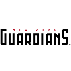
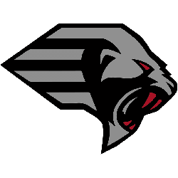
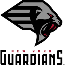
Guardians Wordmark Logo The New York Guardians are a professional American football team that plays in the XFL. The team’s wordmark logo has been part of its identity since they were founded in 2019, and it has come to represent the spirit of New York City itself. The original design for the logo was created by renowned graphic designer Todd …
XFL Wordmark Logo
Wordmark Logos The XFL wordmark logo has undergone several transformations throughout history, reflecting the league’s changing identity and vision. Let’s delve into the captivating history of the XFL wordmark logo and explore its various iterations. In its original incarnation in 2001, the XFL introduced a bold and impactful wordmark logo. The logo featured the acronym “XFL” in all capital letters, …
XFL Alternate Logo
Alternate Logos The XFL, known for its innovative and daring approach to football, has had an intriguing journey when it comes to its alternate logo history. Let’s dive into the captivating evolution of the XFL’s alternate logos and explore the unique visual identities that have graced the league. In its inaugural season in 2001, the XFL introduced its first alternate …
New York Guardians Alternate Logo
Guardians Alternate Logo The New York Guardians have a rich and unique history when it comes to their alternate logo. The XFL, the professional football league that the Guardians are part of, has been around since 2001, and in 2020 they debuted an alternate logo for the team. This new design is meant to be more modern and represent what …
XFL Introduces All Eight Team Names and Logos
XFL owner (and WWE Chairman) Vince McMahon promised that his second attempt at an upstart football league would be a bit more conservative than the first one was at the turn of the century. That certainly seems to be the case with the team names and logos released this week. Gone are the Memphis Maniax, Orlando Rage, and Los Angeles …
New York Guardians Primary Logo
Guardians Primary Logo The New York Guardians’ primary logo is a representation of the team’s commitment to their city and its people. The shield-shaped logo features a bold blue, white, and orange color scheme that pays homage to the colors of both New York City and the state flag. In addition, it has an eagle in flight at its center …
XFL Primary Logo
Primary Logos The primary logo of the XFL has evolved significantly throughout its history, reflecting the league’s changing identity and vision. Let’s journey through time and explore the captivating history of the XFL primary logo. In its inaugural season 2001, the XFL introduced a bold and impactful primary logo. The logo featured a stylized “X” with sharp edges, symbolizing the …