Louisiana Buccaneers
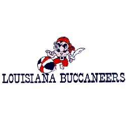
1971 - 1972
A pirate holding a sword is dribbling an ABA red, white, and blue basketball with the wordmark "LOUISIANA BUCCANEERS" in blue.

New Orleans Buccaneers
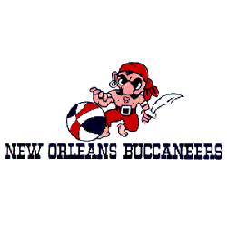
1970 - 1971
Primary Logo
A pirate holding a sword and dribbling a basketball with a wordmark "NEW ORLEANS BUCCANEERS" in blue.

New Orleans Buccaneers
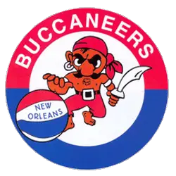
1968 - 1969
Primary Logo
A pirate holding a sword and dribbling a ABA red, white and blue basketball in a ring with a wordmark "BUCCANEERS" in white.

New Orleans Buccaneers
1968 - 1969
Alternate Logo
A pirate holding a sword and dribbling a basketball in a red ring with a wordmark "BUCCANEERS" in white.
New Orleans Buccaneers Logo History
The New Orleans Buccaneers logo featured a bold pirate-inspired design that reflected strength, confidence, and regional character. Among vintage New Orleans logos, it stood out with strong typography and detailed illustration. As the official emblem of the New Orleans Buccaneers ABA team, the logo appeared prominently on uniforms, promotional materials, and merchandise. The design helped establish early professional basketball identity in the city.
Throughout the ABA years, the New Orleans Buccaneers logo maintained its core visual elements while adapting slightly for print clarity and uniform application. Compared to other New Orleans logos, its pirate theme created a memorable brand presence. The consistent use of the emblem reinforced recognition for the New Orleans Buccaneers ABA franchise across league markets and media platforms.
Today, the New Orleans Buccaneers logo remains an important symbol of ABA heritage. Preserved within historic collections of New Orleans logos, it represents the legacy of the New Orleans Buccaneers ABA team and its contribution to professional basketball history. For a deeper look at the franchise’s journey, visit the New Orleans Buccaneers team history page. You can also explore another ABA primary emblem on our Minnesota Pipers logo page to compare league-era designs.


