Edmonton Eskimos
1998 - 2020
Yellow with white and black trim, a double "E" on a green background with yellow, black, and green trim, in a circle.
Edmonton Eskimos
1998 - 2021
Yellow with white and black trim double "E" on a green background with yellow, black and green trim circle. Wordmark "EDMONTON" in green on top and "ESKIMOS" in green with yellow trim.
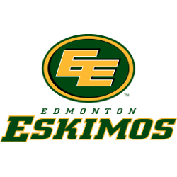
Edmonton Eskimos
1996 - 2021
Yellow with white and black trim, a double "E" on a green background with yellow, black, and green trim, in a circle.

Edmonton Eskimos Alternate Logo
The Edmonton Eskimos alternate logo has undergone several transformations throughout the team’s history. Early versions emphasized traditional elements like the iconic “EE” intertwined letters and football imagery, while later adaptations introduced updated color schemes and streamlined designs. These alternate logos allowed the team to refresh its identity while maintaining the core elements that fans recognize and love. Learn more about Edmonton Eskimos History.
During the documented Edmonton Eskimos logo history, each alternate logo served multiple purposes—from merchandise appeal to media representation. Designers ensured that every Edmonton Eskimos logo PNG was versatile for digital use, print, and promotional materials. The evolution demonstrates how subtle changes can modernize branding without losing historical essence. Check Eskimos Wordmark logo also to see the different variation of team logo.
Collecting all iterations of the Edmonton Eskimos alternate logo provides a clear view of the franchise’s visual journey. From classic to contemporary, these logos complement the primary identity and serve as a testament to the team’s enduring presence in Canadian football. Fans and historians alike can explore these designs to understand the full scope of the Edmonton Eskimos’ visual legacy.


