Edmonton Eskimos
1998 - 2020
Yellow with white and black trim double "E" on a green background with yellow, black, and green trim circle.
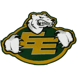
Edmonton Eskimos
1996 - 1998
A white and black polar bear wearing green with yellow trim shirt with eskimos "EE" logo on chest.

Edmonton Eskimos
1988 - 1996
Yellow double "E" on a green background with yellow trim circle.

Edmonton Eskimos
1970 - 1988
The Eskimos original double E logo, a connected "EE" in gold letters inside an almost football shaped green oval with gold and green trim outside

Edmonton Eskimos
1930 - 1970
A green and gold oil derrick rising up over a sheaf of wheat on a green shield. A banner across contains the team name "ESKIMO FOOTBALL CLUB" in black and a gold football above holds the city name of "EDMONTON."
Edmonton Eskimos Primary Logo
The Edmonton Eskimos primary logo has long been recognized for its bold green and gold color scheme and iconic double “E” design. Early versions emphasized simplicity and strong lettering, while later updates refined outlines and proportions. Each Edmonton Eskimos logo PNG preserved clarity for print, merchandise, and digital platforms.
Throughout the Edmonton Eskimos logo history, subtle design adjustments kept the identity modern without losing tradition. The consistent typography and balanced layout made the Edmonton Eskimos primary logo instantly recognizable across the CFL. These updates ensured that every Edmonton Eskimos logo PNG remained adaptable for uniforms, helmets, and promotional materials.
This archive documents all primary logo versions released during the franchise’s history. Each design marks a distinct chapter in the Edmonton Eskimos logo history. For a complete overview of team milestones, visit the official Edmonton Eskimos History page. You can also explore the Edmonton Eskimos Alternate Logo page to compare secondary branding elements.


