Baltimore Claws
1975 - 1976
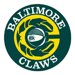
Yellow lobster claws grabbing a ABA basketball inside a green letter "C." Wordmark above and below the letter "C" "BALTIMORE CLAWS."
Baltimore Hustlers
1975 - 1976
Primary Logo
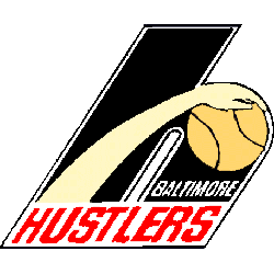
A hand with a basketball inside a large letter "h" with a wordmark "HUSTLERS" in red and "BALTIMORE" in white.
Baltimore Claws Logo History
The Baltimore Claws logo features a dynamic clawed basketball design, symbolizing agility, strength, and competitiveness. As the defining emblem of the Baltimore Claws ABA, this primary logo used bold colors and striking shapes to capture attention. Exploring the Baltimore Claws logo history shows how this design reflected the team’s identity and became a memorable mark among all ABA primary logos.
Throughout its existence, the Baltimore Claws logo maintained a consistent visual identity, making it easy for fans to recognize and connect with the team. High-quality versions of the logo are often preserved in digital archives for collectors and enthusiasts. To learn more about the franchise and its journey in the league, visit the Baltimore Claws team history page. You can also explore another iconic ABA logo on our Anaheim Amigos logo page to compare primary team designs from the league.
The Baltimore Claws logo remains an important part of ABA history. Alongside the documented Baltimore Claws logo history, it continues to represent the bold, competitive spirit of the Baltimore Claws ABA team and the league as a whole.


