Minnesota Muskies
1967 - 1968
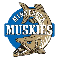
A muskie fish on a blue circle with a wordmark "MINNESOTA MUSKIES" in white.
Muskies Logo History
The Minnesota Muskies logo has a long and storied history, dating all the way back to the team’s inception in 1967. The original logo featured an illustration of a muskie with its mouth wide open, surrounded by a blue circle. This design was used for two seasons before being replaced by another version featuring the same fish but with red accents instead of blue. This new design was used until 1975 when it was changed again to feature just an orange “M” inside of a white circle outlined in black and green.
In 1978, the Minnesota Muskies unveiled their most iconic logo yet: A stylized yellow-orange muskie leaping out from beneath bold black lettering that spelled out “Minnesota Muskies” across its body. This classic look remained unchanged until 1988 when minor adjustments were made to modernize it slightly while still retaining much of its original charm and character – including swapping out some colors for more vibrant hues like purple and teal as well as adding stars around the edge of the lettering itself.
Today, this same basic concept is still being used by various teams throughout North America – albeit with slight variations here or there depending on which organization is using it at any given time – making it one of hockey's longest-running logos ever created! From humble beginnings all those years ago right up through today's modern incarnations, there can be no denying that this beloved symbol has become synonymous not only with hockey fandom but also with Minnesotan pride itself!

Minnesota Muskies
1967 - 1968
Wordmark Logo
Double-lined wordmark "MINNESOTA" on top in blue and "MUSKIES" on bottom in gold with a blue trim.

