Disastrous Logo Rebrand

The 5 Most Disastrous Logo Rebrands in Sports History

Every so often, a beloved franchise decides its identity needs a facelift, and the internet promptly loses its collective mind. A logo isn’t just decoration stitched onto a jersey; it’s shorthand for decades of memory, heartbreak, and glory. Think of the outcry when the Cleveland Browns tweaked their helmet stripe, or the endless debate over the Buffalo Sabres flipping between …

PL Logo History

The History of the Premier League Logo to Present

The visual journey of the premier English football competition crest from the 1992 launch to the present day serves as a precise record of global sports presentation across different eras. The emblem functions as a mirror reflecting organizational growth, massive commercial ambition, and evolving design taste. The visual mark shifted completely from an ornate, highly detailed lion crest to a …

MLS Logo Evolution

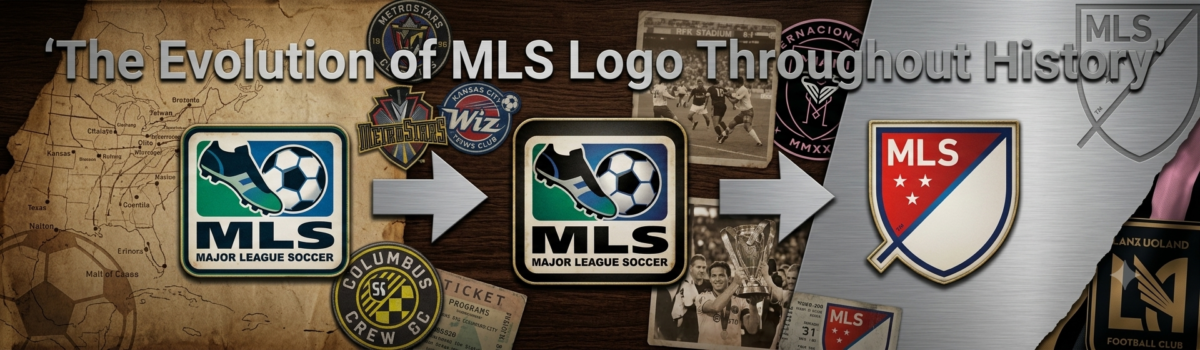
The Evolution of MLS Logo Throughout History

The visual journey of the Major League Soccer identity spans from the 1994 founding to the present day. The crest serves as a precise mirror reflecting league growth, sheer ambition, and evolving design taste across three decades. The emblem carries decades of specific redesign decisions, shifting away from literal interpretations of the sport toward abstract, geometric symbols. The text below …

Brief Badger Logo History

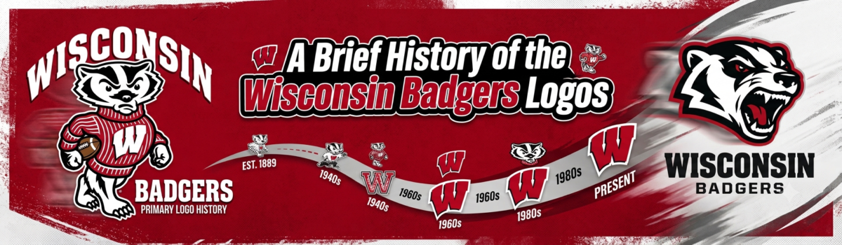
A Brief History of the Wisconsin Badgers Logos

The Wisconsin Badgers have perhaps one of the most recognizable identities in college athletics. The distinctive red color, Bucky Badger mascot, and elegant Motion “W” logo all combine to provide a memorable and impactful identity for the Wisconsin Badgers. This journey is chronicled in A Brief History of the Wisconsin Badgers Logos. Nevertheless, it did not happen instantly, and the …

UCLA Bruins Logo History Rank

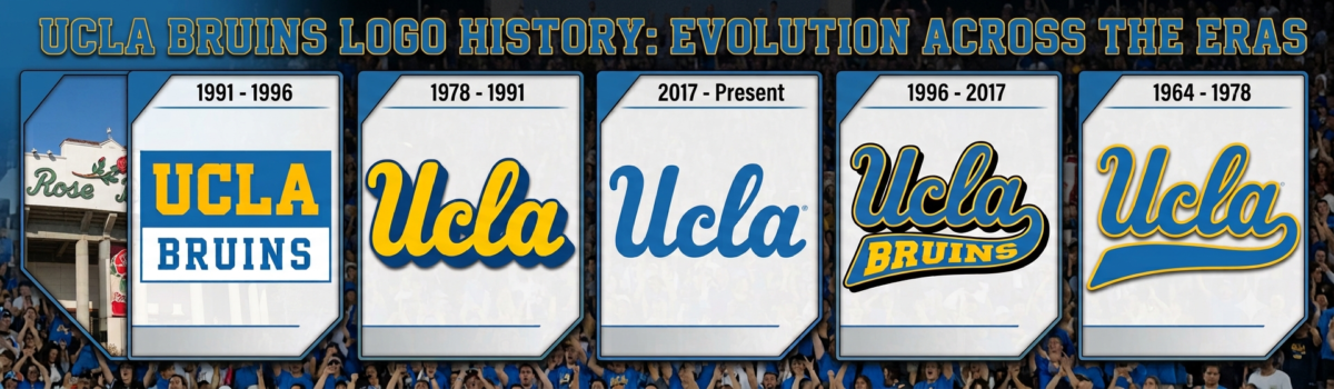
UCLA Bruins Logo History: Ranking Every Era from Bottom to Top

Very few college sports teams boast the superstar power and championship ancestry of the University of California, Los Angeles. From the legendary dominance of coach John Wooden to icons like Kareem Abdul-Jabbar, the blue and gold colors are instantly recognized. While the sports teams have always maintained high standards, their branding visuals have seen some intriguing changes over the years. …

Logos So Memorable

The Golden Era of Sports Logo Design: What Made 1970s–1990s Logos So Memorable

The Golden Era of Sports Logo Design made team branding feel bold, local, and unforgettable. From the 1970s through the 1990s, many sports logos were designed to be instantly recognizable on caps, jerseys, jackets, TV screens, trading cards, stadium signs, and newspaper pages. This period mattered because sports branding was no longer only a small badge on a uniform. Teams …

NBA Top Team Logos

History of the NBA’s Top Team Logos

A team’s logo is more than just a drawing. It’s the banner on which all fans, memories, rivalries, and multi-million-dollar apparel empires stand. In the NBA, the best marks take the form of shorthand: one bull, one leprechaun, one flaming ball, and generations understand the story. Understanding the significance of logos leads us to appreciate NBA’s Top Team Logos, which …

Throwback Logos in Sports

MLB Fan Favorites: The Most Beloved Throwback Logos in Sports History

When you walk into a modern baseball stadium or browse an online sports apparel store, you will immediately notice something fascinating. Alongside the sleek, modern jerseys and high-tech athletic gear, there is a massive sea of vintage neon colors, smiling cartoon mascots, and quirky, hand-drawn letters. Major League Baseball fans do not just tolerate these old-school designs; they actively obsess …