Share A Name Cardinals

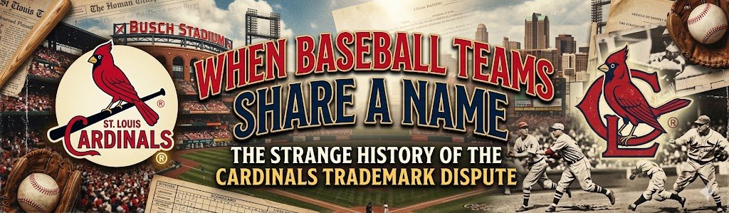
When Baseball Teams Share a Name: The Strange History of the Cardinals Trademark Dispute

There are only so many appropriate names for a baseball team. For whatever reason, MLB owners have long had a fascination with birds: the Baltimore Orioles, Toronto Blue Jays, and St. Louis Cardinals.  If you take a quick look at local amateur or semi-professional baseball or softball leagues throughout North America, you’ll notice many clubs are named after MLB teams. …
Identity Crisis NCAA Logo

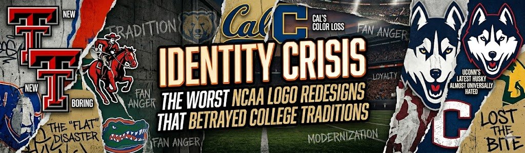
Identity Crisis: The Worst NCAA Logo Redesigns That Betrayed College Traditions

The Modernization Trap: Why NCAA Redesigns Often Backfire The shift towards digital-first design has driven athletic departments to adopt clean vectors, simplified color palettes, and scalable marks optimized for phone screens. This ‘interface-first’ logic often treats a storied athletic program with the same clinical efficiency as a mobile app or a site dedicated to online casino reviews, prioritizing high-contrast clickability …

Neo Mini vs Heritage 3

Neo-Minimalism vs. Heritage: Why 2026 Sports Logos Are Trading Flat Design for ‘Pixel-Sharp’ Texture

For the best part of a decade, the dominant grammar of sports logo design was silence. Clubs flattened their crests, stripped embossing from their badges, and deleted the shadows that gave their shields a sense of weight. The lion became an outline. The crest became a glyph. The colours became brand tokens. It was a logical response to the digital …

NBA Fan Favorites

NBA Fan Favorites: The Most Beloved Throwback Logos in Sports History and the Game Today

Every sports lover knows the instant burst of memories that comes from seeing a classic emblem. From city skylines stitched onto jerseys to cartoon mascots soaring across center court, old-school graphics make fans smile before the opening tip. Even casinos eager to stand out in a crowded market study these brilliant designs; in fact, many casinos around the globe examine …

SLH News - Astros Logo History

Evolution of an Icon: The Complete Visual History of Houston Astros Logos

The Houston Astros’ logo history represents a fascinating journey through baseball design, from Wild West imagery to space-age innovation. Each logo iteration tells a chapter in the franchise’s evolution from the Colt .45s to one of baseball’s most recognizable brands. This visual transformation mirrors Houston’s metamorphosis from a frontier town to “Space City,” reflecting the cultural and technological advancement that …

Top 10 MLB Logo #2

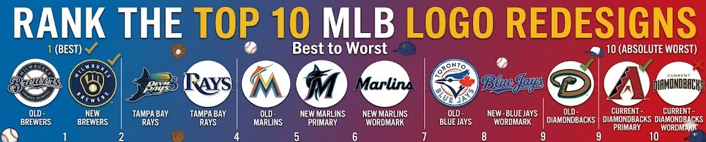
Rank the top 10 Major MLB Logo Redesign: Best to Absolute Worst

Logos are more than just graphics. They carry history, identity, and emotion. In Major League Baseball, a logo redesign can spark excitement—or backlash. Some updates modernize a brand while respecting tradition. Others miss the mark entirely. This ranking looks at 10 notable MLB logo redesigns and ranks them from best to worst. The criteria are simple: clarity, originality, respect for …

SLH News - PL Iconic Symbols

Lions, Devils, and Birds Unpacking Football’s Iconic Symbols

There was a time when a football badge didn’t need explaining. You saw it, you recognized it, and that was enough. It sat on the shirt, part of the whole thing, rarely questioned. Most people could picture their club’s crest without ever really breaking it down.  Only later do you start noticing what’s actually there. Not just the obvious parts, …

SLH News - NFL Hidden Logos

Hidden Meanings: Decoding the Symbolism in Famous NFL Logos

Sports team logos are more than just visual trademarks; they encapsulate a franchise’s deep-seated history, local pride, and evolving identity. In the National Football League, where tradition meets modern flair, every curve, shape, and color often carries a message reflecting the teams’ heritage. Exploring these symbols not only unlocks the story behind the emblem but also reveals how cultural, economic, …

SLH News - Relocation Logo

When Relocation Doesn’t Mean Reinvention: Teams That Resisted Full Logo Redesign After Moving

Relocation is one of the most disruptive moments in a franchise’s existence. Cities change, stadiums change, ownership sometimes changes — yet surprisingly, logos do not always follow the same path. While many moves trigger complete visual overhauls, several professional teams chose a different strategy: controlled continuity. In modern professional sports, branding carries measurable financial value. Logo recognition drives merchandise sales, …