The Crystal Palace FC logo has survived because it does one hard thing well: it feels local without looking stuck in a museum. The eagle, the palace outline, and the red-and-blue shield give supporters quick signals at Selhurst Park, on a phone screen, and on a child’s replica shirt. That matters. Old crests fail when tiny details turn muddy at …
Which Chicago Logo Reigns Supreme? We Ranked Them All
Few cities wear their sports identity as loudly as Chicago. Walk down any street in the Loop, and you’ll spot a wishbone C, a snarling bear, or that unmistakable red crest on a hoodie. The city’s seven major clubs — the Bears, Bulls, Blackhawks, Cubs, White Sox, Fire, and Sky — have spent decades building visual identities, including the beloved …
Why Some Sports Logos Remain Recognizable Without a Team Name
Remove the lettering from a great sports logo, and the team can still be obvious. A distinctive silhouette, color pairing, or geometric element is often enough to trigger recognition from the far side of a stadium. That economy is deliberate: sports identities must work on helmets, score graphics, merchandise, social avatars, and venue screens without depending on small type. This …
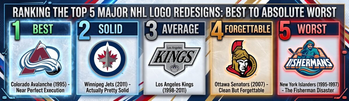
Ranking the Top 5 Major NHL Logo Redesigns: Best to Absolute Worst
I’ve wasted hundreds of hours staring at hockey logos and overthinking design choices most people barely notice. Some redesigns genuinely impress me while others make me want to call up team management and ask if everyone in the meeting room was okay that day. In this post, I’ll be sharing my thoughts on NHL logo redesigns ranked. Logo changes mean …
How Color Choices Help Sports Teams Build a Recognizable Identity
Manchester United can remove the crest from a red shirt and remain Manchester United. New Zealand rugby can do the same with black. The greatest sporting colors identify a team before its name comes into focus. Walk through an airport during a major tournament, and the evidence appears on every concourse. A yellow shirt becomes Brazil, blue belongs to India, …
The Timeless Appeal: Secrets Behind the Baltimore Ravens Logo
A sports logo may look like a picture, but it is more than that. It represents a team, its city, and, most importantly, the memories connected to it. The Baltimore Ravens logo is a great example of a design that has been recognizable for many years. The Ravens joined the NFL in 1996, and the team’s name was inspired by …
NY Giants Logo: The Timeless Power of Two Letters
Most NFL logos have moved in one direction over the decades: more detail, more shading, more going on. The New York Giants went the other way. The mark the team uses today is two lowercase letters, and it is very close to something the franchise first put on its helmets more than sixty years ago. The story of how it …
UCLA Bruins Logo History: Ranking Every Era from Bottom to Top
Very few college sports teams boast the superstar power and championship ancestry of the University of California, Los Angeles. From the legendary dominance of coach John Wooden to icons like Kareem Abdul-Jabbar, the blue and gold colors are instantly recognized. While the sports teams have always maintained high standards, their branding visuals have seen some intriguing changes over the years. …
MLB Fan Favorites: The Most Beloved Throwback Logos in Sports History
When you walk into a modern baseball stadium or browse an online sports apparel store, you will immediately notice something fascinating. Alongside the sleek, modern jerseys and high-tech athletic gear, there is a massive sea of vintage neon colors, smiling cartoon mascots, and quirky, hand-drawn letters. Major League Baseball fans do not just tolerate these old-school designs; they actively obsess …
Fan Favorites: The Most Beloved NFL Throwback Logos in Sports History
Some NFL logos do more than identify a team. They pull people back into a specific kind of Sunday. The old jacket. The heavy helmet. The broadcast graphics. The feeling that every team had a stranger, bolder, more handmade visual identity. That is why throwback logos still matter. They are not just old designs. They are emotional shorthand. A single …