
Block M Logo

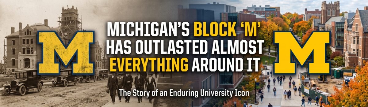
Michigan’s Block “M” Has Outlasted Almost Everything Around It

Michigan football has changed almost beyond recognition since Michigan’s Block M logo first appeared, yet that simple letter keeps doing the same job. Fans spot it immediately, whether it is painted across a stadium, printed on a shirt, or painted on a barn. Michigan football has changed plenty since 1901. The stadium got bigger, the uniforms got technical, television took …
UTEP Rebrand 2026

Why UTEP’s 2026 Rebrand is a Masterclass in Retro-Modern Athletic Identity

The Mountain West Transition: Branding a New Competitive Era When an athletic program changes conferences, it does not simply change its schedule — it redefines its identity, its ambitions, and its visual story to the world. UTEP’s move to a new conference, effective 2026, gave the athletic department something rare: a legitimate, culturally resonant reason to modernize everything fans see, …

Ducks Logo Change over the Years

How Has the Oregon Ducks Logo Changed Over the Years?

Many traditional universities keep their logos the same and do not change them often; the Oregon Ducks, however, do the exact opposite. They’ve transformed their sports program into a platform to experiment with striking, contemporary graphic design. Understanding how the Ducks Logo Changed Over the Years provides insight into their innovative branding. The history of their visuals is particularly enjoyable. …

Brief Badger Logo History

A Brief History of the Wisconsin Badgers Logos

The Wisconsin Badgers have perhaps one of the most recognizable identities in college athletics. The distinctive red color, Bucky Badger mascot, and elegant Motion “W” logo all combine to provide a memorable and impactful identity for the Wisconsin Badgers. This journey is chronicled in A Brief History of the Wisconsin Badgers Logos. Nevertheless, it did not happen instantly, and the …

UCLA Bruins Logo History Rank

UCLA Bruins Logo History: Ranking Every Era from Bottom to Top

Very few college sports teams boast the superstar power and championship ancestry of the University of California, Los Angeles. From the legendary dominance of coach John Wooden to icons like Kareem Abdul-Jabbar, the blue and gold colors are instantly recognized. While the sports teams have always maintained high standards, their branding visuals have seen some intriguing changes over the years. …

Identity Crisis NCAA Logo

Identity Crisis: The Worst NCAA Logo Redesigns That Betrayed College Traditions

The Modernization Trap: Why NCAA Redesigns Often Backfire The shift towards digital-first design has driven athletic departments to adopt clean vectors, simplified color palettes, and scalable marks optimized for phone screens. This ‘interface-first’ logic often treats a storied athletic program with the same clinical efficiency as a mobile app or a site dedicated to online casino reviews, prioritizing high-contrast clickability …

SLH News - Akron Zips Logo History

How Ohio’s Akron Zips Got Their Name and Their Iconic Logo

The University of Akron’s athletics program—otherwise known as the Akron Zips—has a storied history dating back over 130 years. Intercollegiate sports are competitive and exciting across the US, and the Zips are a juggernaut with more than 300 athletes performing across 17 sports.  Moving through their third decade of Mid-American Conference membership going from strength to strength, the Zips are …

SLH News - Nebraska Cornhuskers Logo

Tracing the Legacy: The History of the Nebraska Cornhuskers Logo

The Nebraska Cornhuskers have existed since the late 1800s and have a long and fascinating past. Over the years, the team’s primary logo has changed a few times, each representing a different era of Cornhusker football. The standard red “N” was the school’s main sign from its start in 1890 until 1964. This famous sign showed Nebraska’s shape, circled with …

SLH News - Kentucky Wildcats Logo

The Evolution of the Kentucky Wildcats Logo

The University of Kentucky Wildcats logo is more than a symbol; it represents strength, determination, and an enduring spirit of athleticism. Over the years, it has transformed to embody the characteristics of its teams and their fiercely competitive nature. This article explores the detailed history and evolution of the Kentucky Wildcats logo, highlighting its transformation and the significance behind each …

SLH News - Wisconsin Badgers Logo

Wisconsin Badgers Logo: A Strong Tradition

The Wisconsin Badgers’ team logo has a rich and intriguing history. Since 1913, the University of Wisconsin’s sports division has used eight different logo designs. Each version reflects the team’s strong athletic tradition and the pride they carry in their roots. Being a part of the NCAA for over a century, the Badgers have established themselves as a consistent and …