The Kansas City Royals franchise has existed since the year 1969. The team name “Royals” was derived from a semipro Negro League as well as a minor league Negro League baseball team with the same name. It was also inspired by the city’s annual “American Royal” event that takes place every year. The Royals achieved success not too long after …

The Most Creative Logos In MLB
With batters staring down pitchers and the outfielders staring up to catch pop-up flies, baseball hats are a necessary utility in the sport. Today, baseball caps serve as more than just sun shields. Teams have been using them as effective branding tools, considering that it bears the team’s logo. Logos are a vital aspect of MLB teams, giving fans and …

MLB Team Logo Battle
MLB Primary LogoMLB Alternate LogoMLB Wordmark LogoMLB Team HistoryMLB Greatest Player (Unlimited votes) Choose your favorite current MLB team logo? Arizona Diamondbacks Primary Logo 2024 – Present Athletics Primary Logo 2025 – Present Atlanta Braves Primary Logo 2022 – Present Baltimore Orioles Primary Logo 2019 – Present Boston Red Sox Primary Logo 2009 – Present Chicago Cubs Primary Logo 1979 …
Kansas City Royals Update their Identity
Before the people of Kansas City developed their longstanding and staunch support for the Kansas City Royals baseball team, they had been abandoned by their previous city franchise. The Kansas City Athletics used to Kansas City Royals Primary Logo 2002 – 2018 represented the city in the American League in the past. Unfortunately, the owner of the sports franchise had …
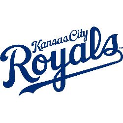
Kansas City Royals Logo History – Wordmark Logo
The Kansas City Royals wordmark logo collection celebrates the team’s proud MLB legacy. Featuring bold crown-inspired script, the Kansas City Royals logo fuels team spirit. This collection highlights team history, uniting fans with the vibrant heritage of Royals KC logo designs. Kansas City Royals 2019 – Present The initials for Kansas City, “KC” on blue shield with gold crown. Royals …
MLB Logo – Wordmark Logos of All MLB Teams
The MLB wordmark logo collection celebrates the vibrant legacy of every Major League Baseball team. Featuring bold designs, the MLB logo unites fans across teams. This collection highlights MLB logo history, showcasing team MLB logo designs that embody the spirit of America’s favorite pastime.MLB Primary LogoMLB Alternate LogoMLB Logo BattleMLB Team HistoryArizona Diamondbacks Double lined wordmark “DIAMOND” on top and …
MLB Logo History – Every MLB Team Logos Collection
Welcome to the ultimate MLB logo showcase, featuring every MLB logo from all 30 teams. Explore the rich MLB logo history, admire the unique team MLB logo designs, and celebrate baseball’s heritage. This collection highlights the evolution of Major League Baseball’s iconic logos, perfect for fans and collectors alike.MLB Logo Collection PRIMARY See each and every team’s primary logos from …
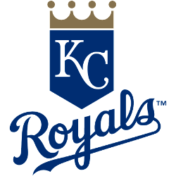
Kansas City Royals Logo History – Alternate Logo
The Kansas City Royals alternate logo collection showcases the team’s vibrant MLB legacy. Featuring bold crown and “KC” designs, the Kansas City Royals logo enhances team spirit. This collection highlights Royals KC logo history, uniting fans with the dynamic tradition of Royals baseball. Kansas City Royals 2019 – Present The initials for Kansas City, “KC” on blue shield with gold …
MLB Logo – Alternate Logos of All MLB Teams
The MLB logo collection showcases vibrant alternate logos for every team, embodying baseball’s rich spirit. Each team MLB logo reflects unique heritage. This collection of alternate logos highlights MLB logo history, uniting fans with the dynamic traditions of Major League Baseball’s iconic franchises.MLB Primary LogoMLB Wordmark LogoMLB Logo BattleMLB Team HistoryArizona Diamondbacks A red diamondback snake head biting on a …
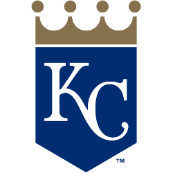
Kansas City Royals Logo History – Primary Logo
The Kansas City Royals primary logo captures the team’s proud MLB heritage. With its iconic crown, the Kansas City Royals logo shines in glory. This collection of primary logos unites fans, showcasing the Royals KC logo legacy at Kauffman Stadium. Kansas City Royals 2019 – Present The initials for Kansas City, “KC” on blue shield with gold crown. Royals Alternate …
- Page 1 of 2
- 1
- 2