When discussing the history of the Boston Red Sox team’s logo, it’s interesting to note the various changes the emblem has undergone over the years. From its original design in 1908 to the modernized one introduced in 2009, the logo has evolved alongside the team’s successes and failures. While the logo itself may not have a direct connection to the …

MLB Logo Tourney
MLB Primary logoNBA Clash of LogosNFL Clash of LogosNHL Clash of LogosClash of Logos MLB Logo Tourney Introducing the Clash of Logos series! In this edition, we present the exhilarating Major League Baseball Logo Tournament. Prepare yourself as every MLB team’s current primary logo goes head-to-head in a thrilling bracket challenge. The question on everyone’s mind: Who possesses the supreme …
MLB Team Logo Battle
MLB Primary LogoMLB Alternate LogoMLB Wordmark LogoMLB Team HistoryMLB Greatest Player (Unlimited votes) Choose your favorite current MLB team logo? Arizona Diamondbacks Primary Logo 2024 – Present Atlanta Braves Primary Logo 2022 – Present Baltimore Orioles Primary Logo 2019 – Present Boston Red Sox Primary Logo 2009 – Present Chicago Cubs Primary Logo 1979 – Present Chicago White Sox Primary …
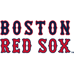
Boston Red Sox Wordmark Logo
Boston Red Sox 2009 – Present The Boston Red Sox logo comprises of a pair of hanging socks visually representing the team’s name, which derives from the ancient plural form of the word “socks”. All wordmark have been removed. Red Sox Alternate LogoRed Sox Primary LogoRed Sox Team HistoryRed Sox Team MerchRed Sox Wordmark Logo The Boston Red Sox are …
MLB Wordmark Logo
Wordmark Logos Arizona Diamondbacks Double lined wordmark “DIAMOND” on top and “BACKS” on bottom in black with a Sonoran sand outline. Descenders of letters “A” and “K” extended to simulate a diamondback’s fangs.See Team LogosAtlanta Braves Slanted wordmark “Braves” in scarlet with a navy outline.See Team LogosBaltimore Orioles A single scripted wordmark “Orioles” in orange with a black outline.See Team …
MLB Logo History
MLB Logos PRIMARY See each and every team’s primary logos from the MLB.See TeamsALTERNATE See each and every team’s alternate logos from the MLB.See TeamsWORDMARK See each and every team’s wordmark logos from the MLB.See TeamsBaseball Sports Fan Products Champion Men’s Sport Shorts, Moisture Wicking, Athletic Shorts, Gym Shorts (Reg. Or Big & Tall) 4.6 out of 5 stars(15278) Buy …
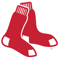
Boston Red Sox Alternate Logo
Boston Red Sox 2009 – Present The Boston Red Sox logo comprises of a pair of hanging socks visually representing the team’s name, which derives from the ancient plural form of the word “socks”. All wordmark have been removed. Red Sox Primary LogoRed Sox Wordmark LogoRed Sox Team HistoryRed Sox Team MerchRed Sox Alternate Logo The Boston Red Sox alternate …
MLB Alternate Logo
Alternate Logos Arizona Diamondbacks A red diamondback snake head biting on a white baseball trimmed in tan.See Team LogosAtlanta Braves Crossed red tomahawks with blue trim and yellow string on a blue circle with the wordmark “ATLANTA BRAVES” on the bottom in white and “1876” on the top in red. Worn on the sleeves of home alternate / throwback uniform.See …
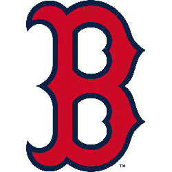
Boston Red Sox Primary Logo
Boston Red Sox 2009 – Present The Boston Red Sox logo comprises of a pair of hanging socks visually representing the team’s name, which derives from the ancient plural form of the word “socks”. All wordmark have been removed. Red Sox Alternate LogoRed Sox Wordmark LogoRed Sox Team HistoryRed Sox Team MerchRed Sox Primary Logo The Boston Red Sox have …
MLB Primary Logo
Primary Logos Arizona Diamondbacks A Sedona Red letter “A” with black and Sonoran Teal diamondback patterning, and the middle of the letter “A” is cut to resemble a snake head; a red and teal half star is present in… See Team Logos Atlanta Braves A red tomahawk with gold and blue details below wordmark “Braves” scripted in blue and red. …
