The Kansas City Royals franchise has existed since the year 1969. The team name “Royals” was derived from a semipro Negro League as well as a minor league Negro League baseball team with the same name. It was also inspired by the city’s annual “American Royal” event that takes place every year.
The Royals achieved success not too long after the franchise started. Between the years 1976-1985, the Royals would make the playoffs seven times. The Kansas City Royals have 4 AL Pennants and 2 World Series Championships to their credit. Great players such as George Brett, Bret Saberhagen, Willie Wilson, and Amos Otis. Therefore, it wouldn’t take classic neon signs for us to illustrate the importance of ensuring that this team’s logo history is discussed.
Even though the Kansas City Royals have been around for only five decades, the Kansas City Royals have had quite a few changes to their brand identifier over the years.

Kansas City Royals Primary Logo 1969 - 1978
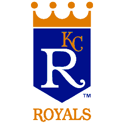
The first logo in franchise history was made in 1969. The honor of designing this logo was given to Hallmark Cards Inc. Even though the job was given to several artists, the work of an artist by name of Shannon Manning shined above the rest. Manning designed a crown logo. As with any crown, the yellow crown was placed on the logo. The foundation of the logo is the big blue shield in the middle. A smaller gold “KC” word mark within the blue shield can be seen on the top half of the logo to the upper right. The remaining blue shield is taken up by a big white, classic-looking “R.”
The bottom of the logo contains a yellow “ROYALS” wordmark written in a combination of classic and bold font. This logo lasted until 1978.
In 1979, the Kansas City Royals changed their primary logo slightly. The logo still had the yellow crown on top. There is still a blue shield in the middle. The gold “KC” wordmark can be seen on top of the blue shield within the logo to the upper right, and the white classic-looking “R” wordmark still dominates the overall space within the blue shield. The key difference is that the yellow crown and the blue shield with the wordmarks are slightly smaller than its predecessor.
The major difference in the 2nd primary logo can be seen at the bottom of the logo. While its predecessor had a yellow bold and classic-looking “ROYALS” wordmark, this logo has a “ROYALS” wordmark that is in a classic font. It is colored blue. This logo lasted until 1985.

Kansas City Royals Primary Logo 1986 - 1992
In 1986, the Royals adopted a third primary logo, a subtle upgrade from its predecessors. Just like the first two primary logos, the Royals still had the logo with a yellow crown on top and a blue shield with the wordmark mentioned above. However, they were all somewhat smaller than their predecessors.
The other key difference is that the same blue classic “ROYALS” wordmark is larger than its predecessors. The “ROYALS” wordmark is so large that one’s eyes were drawn to it immediately upon looking at the logo. This lasted until 1992.

Kansas City Royals Primary Logo 1993 - 2001
In 1993, the Royals switched their primary logo due to key changes. The crown on top of the logo was no longer yellow but gold. While the logo still contains the blue shield, the “KC” within the blue shield was also changed to gold. However, the blue shield still had the white “R” that dominated the space of the blue shield. It also has the large “ROYALS” wordmark in a classic font like its predecessor. This logo lasted until 2001.
In 2002, the Royals’ new primary logo included several changes. There was still a gold crown and a big blue “ROYALS” classic wordmark like its predecessor. However, the changes came within the blue shield. The big white “R” can no longer be seen in the blue shield. The blue shield is dominated by a white “KC” classic wordmark. This lasted until 2018.
The Royals’ current primary logo was unveiled in 2019. It had one major change from its predecessor. The logo still has the gold crown and the blue shield. It still has the white “KC” wordmark within it. The major difference is that the large blue “ROYALS” wordmark in the classic font was removed.
Sports Logo History is a community of sports logo enthusiast who enjoys the history of each team’s logo history. Sports Logo History has primary logos, alternate logos, or wordmark logos from the NFL, NBA, MLB, MLS, NHL, Premier League, WNBA, CFL, NCAA, ABA, USFL, AAF, and XFL.
Our partner site is Sports Team History takes a look at the history of each and every professional sports team. In addition, we have added Sports News History to our sports history websites. 24/7 non-stop sports news that's worth knowing. Finally, the premier sports team marketplace for your favorite team or college with thousands of items for you to peruse at Sports Market History.

