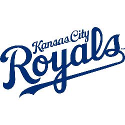
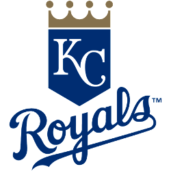
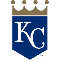
Royals Wordmark Logo The Kansas City Royals have a long and storied history, which is reflected in their wordmark logo. The original Royals logo was adopted when the team moved to Kansas City in 1969. It featured an interlocking “KC” with a crown above it, set against a royal blue background. This design remained largely unchanged until 1993 when the …
Kansas City Royals Alternate Logo
Royals Alternate Logo The Kansas City Royals have a long and storied history with their alternate logo. The team was founded in 1969, and the first alternate logo they used was an interlocking “KC” that appeared on the caps of their players during home games. This design has remained a staple for over 40 years, but it wasn’t until 1985 …
Kansas City Royals Primary Logo
Royals Primary Logo The Kansas City Royals have a long and storied history, dating back to 1969 when the team was founded. Throughout their existence, they’ve had several different logos that represent the city and its baseball heritage. The primary logo of the Royals has gone through many changes over time, but it has always been an important part of …
Cincinnati Royals Primary Logo
Royals Primary Logo The Cincinnati Royals primary logo history is an interesting one, as it has evolved over the years and changed with the times. The original logo was created in 1949 when the team was first founded and featured a shield shape with a blue background, white lettering spelling out “Cincinnati” at top of the design and two basketballs …