The St. Joseph’s Hawks logo history features a wide range of creative designs used through different eras. Each St. Joseph’s Hawks alternate logo highlights the identity and spirit of St. Joseph Hawks basketball. This page brings together every alternate logo from the team’s early years to the present day. It offers a clear look at how the program’s visual style …
St. Joseph’s Hawks Logo History – Primary Logo
The St. Joseph’s Hawks logo history showcases the evolution of the team’s primary logos over the years. Fans can view each St. Joseph’s Hawks Primary logo from early designs to the modern version. This page also includes St. Joseph Hawks basketball logos, offering a complete view of the team’s visual identity from the start to present in a clear and …
Atlanta Hawks Logo History – Alternate Logo
Our Atlanta Hawks logo alternate collection captures the team’s vibrant Georgia legacy. From bold alternate designs to historic emblems, learn about Atlanta Hawks logo history, revisit the old Atlanta Hawks logo, and find Atlanta Hawks logo png files, showcasing unique logos for every Hawks fan. Atlanta Hawks 2021 – Present A minor update to the Atlanta Hawks primary logo for …
Atlanta Hawks Logo History – Wordmark Logo
Our Atlanta Hawks logo wordmark collection highlights the team’s distinctive wordmark designs. From classic styles to modern updates, learn about Atlanta Hawks logo history, explore old Atlanta Hawks logo variations, and find Atlanta Hawks logo png files, preserving unique wordmarks for every Hawks fan. Atlanta Hawks 2021 – Present A minor update to the Atlanta Hawks primary logo for the …
St. Louis Hawks Logo History – Primary Logo
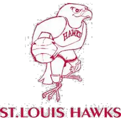
Soar into the legacy of the St. Louis Hawks logo and its timeless tale. From classic designs to bold emblems, we unpack the St. Louis Hawks history, share St. Louis Hawks NBA details, and spotlight the Hawks symbol, celebrating the team’s proud spirit for every Hawks fan.St. Louis Hawks 1958 – 1968 In 1957 the Hawks introduced this Disney-looking cartoon …
Atlanta Hawks Logo History – Primary Logo
The Atlanta Hawks logo has changed multiple times, reflecting different eras in the team’s journey. From its earliest days to its modern design, each version of the primary logo holds meaning. Whether you’re a collector or fan, this page presents the complete Atlanta Hawks logo history, including the old Atlanta Hawks logo and high-quality Atlanta Hawks logo PNGs. Atlanta Hawks …

