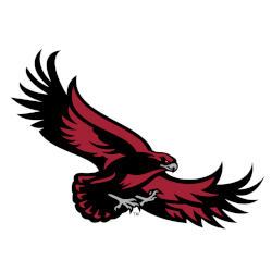
Hawks Primary Logo The St Joseph’s Hawks started with a cartoon-looking hawk as their primary logo and update the logo in 2001. The new and updated hawk is a high soaring hawk looking down on its prey. Hawks Alternate LogoHawks Wordmark LogoHawks School History Choose your favorite St. Joseph’s Hawks primary logo? St. Joseph’s Hawks Primary Logo 2018 – Present …
Milwaukee Hawks Primary Logo
Hawks Primary Logo The Milwaukee Hawks Primary Logo has been used by the team since its inception in 1951. It is a classic design that has stood the test of time and continues to be used today. The logo features an image of a hawk with wings spread wide, ready for flight, set against a white background with red trimming …
St. Louis Hawks Primary Logo
Hawks Primary Logo The St. Louis Hawk’s primary logo has a long and interesting history. The team was founded in 1946 as the Tri-Cities Blackhawks, but moved to St. Louis in 1955 and changed its name to the Hawks at that time. During this period, they also adopted their now iconic logo of an angry hawk perched atop a basketball …
Atlanta Hawks Primary Logo
Hawks Primary Logo The Atlanta Hawk’s primary logo has a long and storied history. Since its inception in 1946, the team has gone through several iterations of its primary logo to reflect the changing times. The original design featured an abstract hawk head with wings outstretched against a blue background, symbolizing strength and power. This remained intact until 1971 when …