
Ottawa Rough Riders
A black, red and white log driver with a brown mustache and red scarf and a log driver’s pike in the background. Changing back to black and removing the blue color from the 1994 primary logo.
Ottawa Rough Riders
A blue, red and white log driver with a brown mustache and red scarf and a log driver’s pike in the background. For the 1994 season the team unveiled its final logo design with the team colors changing from black, silver, and red, to dark navy, red, and gold. The color changes proved to be unpopular as the team dropped dark navy in favor of a return to black for the 1995 season.
Ottawa Rough Riders
A red with silver trim letter “R” and a black with silver trim letter “R” with red flames trailing behind the letters.
Ottawa Rough Riders
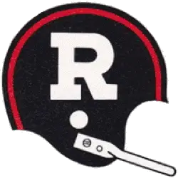
A white letter “R” on black with red stripe helmet with full grey facemask.
Ottawa Rough Riders
A white letter “R” on black with red stripe helmet and a single bar white facemask.
Ottawa Rough Riders
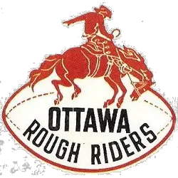
A orange cowboy riding a orange horse on a white with orange trim football and a wordmark “OTTAWA” in black and “ROUGH RIDERS” in black and arched.
Ottawa Rough Riders
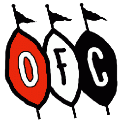
Letters “OFC” on red, white and black footballs with three black pennants. “OFC” represents the team name Ottawa Football Club.
Ottawa Rough Riders Logo History
The early Ottawa Rough Riders logo designs reflected traditional football aesthetics. Simple typography and classic color schemes defined the identity during the team’s formative decades. As Ottawa Rough Riders football grew in popularity, the primary logo evolved to include stronger lines and more refined lettering.
Throughout the documented Ottawa Rough Riders logo history, designers balanced modernization with heritage. Updates improved clarity for uniforms, helmets, and merchandise while preserving the team’s established identity. Each version of the Ottawa Rough Riders logo represented a distinct era in the franchise’s development.
This archive highlights every official primary emblem used in Ottawa Rough Riders football competition. The full Ottawa Rough Riders logo history illustrates how branding adapted over time while maintaining tradition. For detailed milestones, visit the Ottawa Rough Riders History page. You can also explore the CFL Alternate Logo page to view other teams design variations.
Rough Riders Products
Auto Amazon Links: Could not resolve the given unit type, . Please be sure to update the auto-insert definition if you have deleted the unit.
