Ottawa Renegades
2002 - 2005
A black, brown, grey and red Renegade holding brown football below large red maple leaf and wordmark "OTTAWA" in white on the maple leaf and "RENEGADES" in a two tone color of black and red gradient.
Ottawa Renegades
2002 - 2005
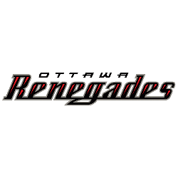
A wordmark "OTTAWA" in black and "RENEGADES" in a two tone color of black and red gradient.
Font: Custom
Ottawa Renegades Wordmark Logo
The Ottawa Renegades wordmark logo emphasized bold lettering and structured alignment. Unlike graphic-heavy emblems, the wordmark relied on typography to maintain a clean and professional look. Throughout the Ottawa Renegades logo history, these designs helped establish consistent branding during the Ottawa Renegades CFL era. For a complete franchise timeline, visit the Ottawa Renegades History page.
Over time, refinements in font style, spacing, and color balance improved clarity across uniforms and promotional materials. Each Ottawa Renegades wordmark logo reflects a specific stage of Ottawa Renegades CFL branding. These updates ensured better readability while preserving the team’s visual identity.
The broader Ottawa Renegades logo history demonstrates the importance of strong typography in sports branding. While the primary emblem carried symbolic elements, the wordmark ensured immediate recognition. To compare these lettering styles with the official emblem, explore the Ottawa Renegades Primary Logo page for a detailed visual reference.
Football Sports Fan Products