The American athletic conference logo has evolved as the league expanded and its identity grew across college sports. Each update to the AAC logo supports the branding of American athletic teams and reflects a stronger competitive spirit. This page covers the full history of the conference’s primary logo and also notes how other leagues, including ACC teams primary logo styles, influence modern designs.

East Carolina Pirates
A white and black scull and cross bones with a purple with yellow trim pirate's hat with the letters "ECU" in yellow.

Florida Atlantic Owls
A front view of an owl in blue, white, and red. Former alternate logo.

Memphis Tigers
A blue and grey tiger leaping out of a blue with the white trim letter "M."

North Texas Mean Green
A green and white attacking eagle next to a wordmark "NORTH TEXAS" in green with black trim.

Rice Owls
An Olde English letter "R" in blue. Former alternate logo. Different spacing on this logo.
South Florida Bulls
A green with the white and gold trim letter "U" in the shape of a bull's head with horns. The shades of green and gold changed.
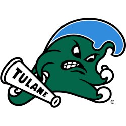
Tulane Green Wave
Called the "Angry Wave" is a green wave with a blue head and holding a white with a black megaphone with the wordmark "TULANE" in black.

Tulsa Golden Hurricane
A revising of the scripted wordmark "Tulsa" and the hurricane flag design. The double outlines on the Script were eliminated. Blue was slightly changed.

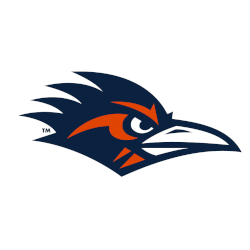
UTSA Roadrunners
A side view of a roadrunner's head in orange, blue, and white. Former alternate logo.

Wichita State Shockers
A pumped-up shocker with a black sweater and the initials "WSU" in white on the sweater. Added a white outline.
American Athletic Conference Logo History
The early American athletic conference logo introduced a bold and modern design that represented the conference’s new direction. The first AAC logo emphasized strength through sharp lettering and a strong star symbol, creating a unified identity for American athletic teams. Much like the attention given to ACC teams primary logo updates, these early versions played a major role in shaping brand recognition. You may also visit our AAC Alternate Logo page for more visuals.
As membership shifted, the American athletic conference logo received updates that improved clarity and balance. The refined AAC logo matched the growth of American athletic teams, giving the league a more polished national presence. The design standards often followed trends seen in major leagues, similar to how the ACC teams primary logo evolved over time. You can read more about the conference on its Wikipedia page.
Today’s American athletic conference logo is a recognizable mark across college sports. The current AAC logo blends clean lines with a modern layout that aligns with branding approaches used by top conferences, including ACC teams primary logo designs. This identity reflects stability and excellence for all American athletic teams. Visit our internal alternate logo section for a complete visual history of the conference’s evolution.
College Sports Fan Products