Calgary Stampeders
A white horse galloping with a black drop shadow. Revised primary logo from the ’90s.
Stampeders Primary Logo
The Calgary Stampeders have been a part of the Canadian Football League (CFL) since 1945 and their primary logo has seen many changes over the years. The original logo was designed by Bob Winslow in 1946 and featured a black horse head with a white background, which is still used today as an alternate version of the team's current logo.
In 1978, after several decades with their original design, Calgary introduced its first major update to its primary logo. This new design featured three horses' heads arranged in an arrow-like formation that pointed toward each other and included both red and yellow colors to represent Canada’s national flag at the time, showcasing the Calgary Stampeders Alternate logo.
Then in 1997, just before they moved into McMahon Stadium for their inaugural season there as well as when they celebrated 50 years of CFL football history during the 1998–1999 season year; The Stamps went through another transformation with yet another updated version of their iconic symbol - this one featuring two stallions facing away from each other while standing atop a circular crest outlined by bold text reading “Calgary Stampeders” around it. This became known simply as ‘the double horsehead’ or sometimes referred to unofficially among fans & supporters alike affectionately at times too - like 'The Two Horsemen'. It also came along right about when then club president Doug Mitchell began his tenure leading up until 2008 – so some might even consider it somewhat symbolic for him personally being associated closely together alongside those particular significant eras within franchise history!
Finally fast forwarding all way back up till the present day though now…in 2018 we saw yet again another rebranding effort take place whereupon we were presented our fourth official iteration/incarnation ever since inception nearly 75yrs ago come 2020: A single galloping stallion set against striking red & white backdrop complete w/bold lettering spelling out "Stamps" across bottom portion thereof..and thusly making sure everyone knows exactly who these proud western Canadians are whenever taking field action upon any given day! All said n done therefore it would appear fair enough to say that no matter what form or fashion may choose to express itself over the course next few generations however long the team remains active going forward hereinto the future; There will always be one constant thread woven throughout the fabric respective identity regardless: That unmistakable signature stamp belonging solely none but only beloved hometown heroes themselves ——> THE CALGARY STAMPEDERS!!!

Calgary Stampeders
2016 - 2020
A galloping white horse with a black drop shadow on a red circle with black and white trim.
The gradient/shine from the 2013-2015 logo removed for 2016.

Calgary Stampeders
2013 - 2016
A galloping white with black drop shadow horse on a red circle with a gradient and a black and white trim.

Calgary Stampeders
1996 - 2013
A white horse galloping.
Calgary Stampeders
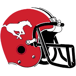
1987 - 1996
A galloping white horse on the side of a red helmet with a full black facemask.

Calgary Stampeders
1972 - 1987
A galloping white horse on the side of a red helmet with a single-bar white with red trim facemask.

Calgary Stampeders
1945 - 1972
A red cowboy on a bucking bronco in front of a football with wordmark STAMPEDERS" in red.
College Sports Fan Products


