UFL Primary LogoUFL Team History (Unlimited votes) Choose your favorite UFL logo? Arlington Renegades Primary Logo 2024 – Present Birmingham Stallions Primary Logo 2024 – Present DC Defenders Primary Logo 2024 – Present Houston Roughnecks Primary Logo 2024 – Present Memphis Showboats Primary Logo 2024 – Present Michigan Panthers Primary Logo 2024 – Present San Antonio Brahmas Primary Logo 2024 …
UFL Primary Logo
Primary Logos Arlington Renegades A custom letter “R” in light blue. Wordmark “ARLINGTON” in black and “RENEGADES” in light blue. Carried over from the XFL with a new shade of blue. See Team Logos Birmingham Stallions A golden and red horse’s head has a gold wordmark “BIRMINGHAM” and “STALLIONS” below in red. Carried over from the USFL with new shades …
San Antonio Brahmas Wordmark Logo
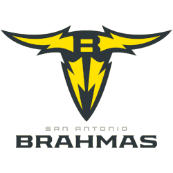
San Antonio Brahmas 2024 – Present You might find a black and yellow Brahma skull in the desert, including four yellow lightning bolts in the shape of a bull’s head. A black letter “B” is at the top of the bull’s head. Wordmark below “SAN ANTONIO” in silver and “BRAHMAS” in black. Carried over from the XFL with a new …
San Antonio Brahmas Alternate Logo
San Antonio Brahmas 2024 – Present You might find a black and yellow Brahma skull in the desert, including four yellow lightning bolts in the shape of a bull’s head. A black letter “B” is at the top of the bull’s head. Wordmark below “SAN ANTONIO” in silver and “BRAHMAS” in black. Carried over from the XFL with a new …
2023 XFL Teams and Logos
It is no secret that one has a healthy skepticism regarding the XFL. The XFL has had its failures to launch in the past. Over 20+ years ago, Vince Mcmahon and Dick Ebersol’s XFL failed after a promising start as fans soured on a product that mixed Vince McMahon’s version of sports entertainment with the game of football. In 2020, …
San Antonio Brahmas Primary Logo
San Antonio Brahmas 2024 – Present You might find a black and yellow Brahma skull in the desert, including four yellow lightning bolts in the shape of a bull’s head. A black letter “B” is at the top of the bull’s head. Wordmark below “SAN ANTONIO” in silver and “BRAHMAS” in black. Carried over from the XFL with a new …
XFL Team Logo Battle
XFL Primary LogoXFL Alternate LogoXFL Wordmark LogoXFL Team History (Unlimited votes) Choose your favorite XFL logo? Arlington Renegades Primary Logo 2023 – 2024 DC Defenders Primary Logo 2023 – 2024 Houston Roughnecks Primary Logo 2023 – 2024 Orlando Guardians Primary Logo 2023 – 2024 San Antonio Brahmas Primary Logo 2023 – 2024 Seattle Sea Dragons Primary Logo 2023 – 2024 …
XFL Wordmark Logo
Wordmark Logos Arlington Renegades Wordmark “ARLINGTON” in black and “RENEGADES” in light blue.See Team LogosDC Defenders Wordmark “DC DEFENDERS” in red.See Team LogosHouston Roughnecks Wordmark “HOUSTON” in red and “ROUGHNECKS” in blue.See Team LogosLos Angeles Wildcats Wordmark “WILDCATS” in yellow.See Team LogosOrlando Guardians Wordmark “ORLANDO” in sliver and “GUARDIANS” in dark green.See Team LogosSeattle Sea Dragons Wordmark “SEATTLE” in green …
XFL Alternate Logo
Alternate Logos Arlington Renegades A custom letter “R” in light blue. Wordmark “ARLINGTON” in black and “RENEGADES” in light blue.See Team LogosDC Defenders A red with white outline 5-sided form with two crisscrossed white lightning bolts and three white stars.See Team LogosHouston Roughnecks A red and blue gear with the letter “H” inside the gear.See Team LogosLos Angeles Wildcats Initials …
XFL Logo History
XFL Logos PRIMARY See each and every team’s primary logos from the XFL.See TeamsALTERNATE See each and every team’s alternate logos from the XFL.See TeamsWORDMARK See each and every team’s wordmark logos from the XFL.See TeamsFootball Sports Fan Products 47 Brand MLB New York Yankees Branson Cap B-BRANS17CTP, Unisex 4.7 out of 5 stars(13520) Buy Now 47 New York Yankees …
- Page 1 of 2
- 1
- 2


