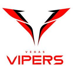
Vipers Wordmark Logo The Vegas Vipers is the newest team in the XFL, and their wordmark logo has quickly become a symbol of pride for fans. The logo features an intimidating black viper coiled around a football with its head pointed forward, ready to strike. Alongside this image are two bold words: “Vegas” and “Vipers”. This simple yet powerful design …
Vegas Vipers Alternate Logo
Vipers Alternate Logo The Vegas Vipers are a professional American football team that is part of the XFL, a new league created by Vince McMahon. They have an alternate logo that has been around since its inception in 2001. The logo features two vipers intertwined with each other and encircled by flames, which symbolize the excitement and energy of Las …
2023 XFL Teams and Logos
It is no secret that one has a healthy skepticism regarding the XFL. The XFL has had its failures to launch in the past. Over 20+ years ago, Vince Mcmahon and Dick Ebersol’s XFL failed after a promising start as fans soured on a product that mixed Vince McMahon’s version of sports entertainment with the game of football. In 2020, …
Vegas Vipers Primary Logo
Vipers Primary Logo The Vegas Vipers are a professional American football team based in Las Vegas, Nevada. They compete in the XFL as part of the West Division. The team was founded by Vince McMahon and is owned by Alpha Entertainment LLC. The primary logo of this franchise has evolved over time to reflect its current identity and brand image. …
XFL Team Logo Battle
XFL Logo Battle Get ready for the ultimate XFL Teams Logo Battle! As a passionate fan, it’s your chance to cast your vote and determine which logos reign supreme among all the current XFL teams. This exciting competition allows you to choose not just one, but as many of your favorite logos as you like. So, let your true team …
XFL Wordmark Logo
Wordmark Logos The XFL wordmark logo has undergone several transformations throughout history, reflecting the league’s changing identity and vision. Let’s delve into the captivating history of the XFL wordmark logo and explore its various iterations. In its original incarnation in 2001, the XFL introduced a bold and impactful wordmark logo. The logo featured the acronym “XFL” in all capital letters, …
XFL Alternate Logo
Alternate Logos The XFL, known for its innovative and daring approach to football, has had an intriguing journey when it comes to its alternate logo history. Let’s dive into the captivating evolution of the XFL’s alternate logos and explore the unique visual identities that have graced the league. In its inaugural season in 2001, the XFL introduced its first alternate …
XFL Logo History
XFL Logos The XFL logo has undergone a fascinating journey since the league’s inception in 2001. Let’s delve into the captivating history of the XFL logo and explore the evolution of its visual identity. In its inaugural season, the XFL introduced a bold and distinctive logo that embodied the league’s rebellious and unconventional spirit. The logo featured a stylized “X” …
XFL Primary Logo
Primary Logos The primary logo of the XFL has evolved significantly throughout its history, reflecting the league’s changing identity and vision. Let’s journey through time and explore the captivating history of the XFL primary logo. In its inaugural season 2001, the XFL introduced a bold and impactful primary logo. The logo featured a stylized “X” with sharp edges, symbolizing the …