Welcome to the UFL Teams Logo Battle, where football fans can explore logo designs from the newly merged league and vote for their favorites. Participate in the best UFL logos poll and support your team while helping decide the best UFL team logos that represent the identity and spirit of the league.UFL Primary LogoUFL Team History (Unlimited votes) Choose your …
UFL Logo History – United Football League Teams Primary Logo
The UFL logo represents the identity of the United Football League and its teams. This page explores the evolution of the United Football League logo along with all primary UFL team logos. From the league’s early years to the modern redesign, each logo reflects the branding, values, and history of professional football under the UFL.UFL Logo BattleUFL Team History Birmingham …
2023 XFL Teams and Logos
It is no secret that one has a healthy skepticism regarding the XFL. The XFL has had its failures to launch in the past. Over 20+ years ago, Vince Mcmahon and Dick Ebersol’s XFL failed after a promising start as fans soured on a product that mixed Vince McMahon’s version of sports entertainment with the game of football. In 2020, …
XFL Teams Logo Battle – Vote for the Best XFL Logos
Welcome to the XFL Teams Logo Battle, where football fans can explore every XFL team logos design and vote for their favorites. Compare styles, support your team, and help decide the best XFL logo as fans rank the most recognizable symbols representing the exciting teams of the XFL.XFL Primary LogoXFL Alternate LogoXFL Wordmark LogoXFL Team History (Unlimited votes) Choose your …
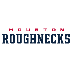
Houston Roughnecks Logo History – Wordmark Logo
The Houston Roughnecks logo history includes the bold and recognizable Houston Roughnecks wordmark logo used since the franchise’s launch. This page highlights official Houston Roughnecks logo PNG files and traces the evolution of the team’s typography from its XFL debut to its modern league presentation across every wordmark version. Houston Roughnecks 2024 – 2025 A red with blue trim letter …
XFL Wordmark Logo
Wordmark Logos Arlington Renegades Wordmark “ARLINGTON” in black and “RENEGADES” in light blue.See Team LogosDC Defenders Wordmark “DC DEFENDERS” in red.See Team LogosHouston Roughnecks Wordmark “HOUSTON” in red and “ROUGHNECKS” in blue.See Team LogosLos Angeles Wildcats Wordmark “WILDCATS” in yellow.See Team LogosOrlando Guardians Wordmark “ORLANDO” in sliver and “GUARDIANS” in dark green.See Team LogosSeattle Sea Dragons Wordmark “SEATTLE” in green …
XFL Alternate Logo
Alternate Logos Arlington Renegades A custom letter “R” in light blue. Wordmark “ARLINGTON” in black and “RENEGADES” in light blue.See Team LogosDC Defenders A red with white outline 5-sided form with two crisscrossed white lightning bolts and three white stars.See Team LogosHouston Roughnecks A red and blue gear with the letter “H” inside the gear.See Team LogosLos Angeles Wildcats Initials …
Houston Roughnecks Logo History – Alternate Logo
The Houston Roughnecks logo history includes bold alternate designs that complement the team’s primary identity. This page highlights every official Houston Roughnecks alternate logo and showcases updated Houston Roughnecks logo PNG files from the XFL era to today. Each version reflects the franchise’s evolving style and competitive spirit. Houston Roughnecks 2024 – 2025 A red with blue trim letter “H” …
XFL Introduces All Eight Team Names and Logos
XFL owner (and WWE Chairman) Vince McMahon promised that his second attempt at an upstart football league would be a bit more conservative than the first one was at the turn of the century. That certainly seems to be the case with the team names and logos released this week. Gone are the Memphis Maniax, Orlando Rage, and Los Angeles …
XFL Logo History
XFL Logos PRIMARY See each and every team’s primary logos from the XFL.See TeamsALTERNATE See each and every team’s alternate logos from the XFL.See TeamsWORDMARK See each and every team’s wordmark logos from the XFL.See Teams”The Legends May Retire, But the Gear is Forever” History is written on the field, but it’s worn in the stands. From throwback threads to …
- Page 1 of 2
- 1
- 2


